


“Can you make a quick one-pager?”
If you’ve ever supported a sales team, you’ve heard the ask. Definitely more than once. (Maybe more than once this week?)
And while it sounds straightforward, you already know “one-pager” can mean just about anything. The result can be a never-ending game of one-pager Whac-A-Mole.

(Suddenly, you’re 14 rounds deep in Google Docs with a rep who “loved the last one but it just needs a few tweaks.”)
This guide is here to help you get ahead of that.
Below, you’ll learn what a sales one-pager actually is (and isn’t) and different types you might want in your back pocket. You’ll also get real sales one-pager examples from companies doing it well, as well as some tips for managing your one-pagers at scale.

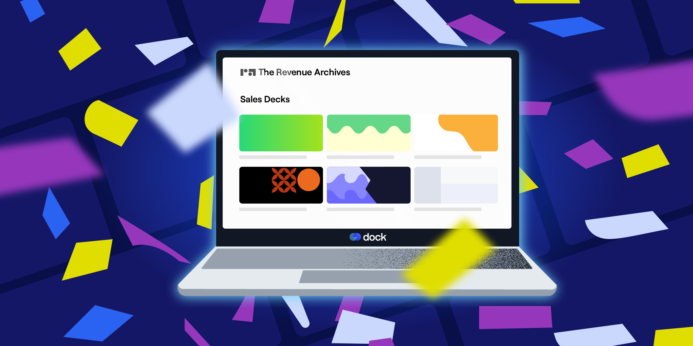
Want to see our full archive of one-pagers?
Check out 30+ examples in The Revenue Archives.
.png)
What is a sales one-pager?
A sales one-pager is a simple, shareable 1-2 page document that helps move a deal forward.
Think of it as a leave-behind to a conversation, summarizing what your product does, why it matters, and how it solves a specific problem. It should be easy to skim, easy to share, and easy to act on.
Historically, one-pagers were PDFs or printed sales sheets.
In 2025? They can be standalone landing pages, sections of a sales room, or part of a larger digital experience. The format has evolved, but the goal is the same: make it easy for buyers to understand and share a specific solution internally.
Common types of one-pagers
'One-pager' is a broad term. In sales, the format depends on where your prospects are in the funnel and your goals for engaging with that prospect.
Here’s a breakdown of the most common types.
- Product overview: High-level summary of what the product does and who it’s for
- Pricing breakdown: Simple, side-by-side pricing tiers or custom quote details
- Competitive comparison: Feature breakdown showing how you stack up
- Demo follow-up: Recap of what was shown in a demo, plus next steps
- Persona-specific pitch: Tailored message based on role (e.g., IT leader, finance, ops)
- Use case or solution overview: How your product solves a specific problem
- Objection handling or FAQ: Address common concerns or questions
- Case study highlight: Success story with results and testimony
- Security and compliance summary: Specs for buyers who need to check the boxes
- Onboarding preview: What to expect after signing, timelines, key milestones
- ROI or business case: High-level justification for finance
- Pilot or trial overview: What’s included, how it works, and what happens after
What makes a great one-pager (regardless of type)
No matter what format you use or where it fits in the sales cycle, a strong sales one-pager should:
- Be easy to skim
- Stay consistent when shared
- Highlight a clear value prop
- Make the next step obvious
- Give a salesperson the confidence to send it, and buyers the confidence to share it internally
Sales one-pager examples
We’ve curated a range of real-world sales one-pagers—from product overviews to pricing breakdowns—to show you what good looks like.
And while there’s no single “right” way to build one, there are plenty of smart examples worth borrowing from. For each, we’ve highlighted the use case, audience, and what makes it work, so you can find the format (and inspo) that fits your goal.
1. Pendo product overview
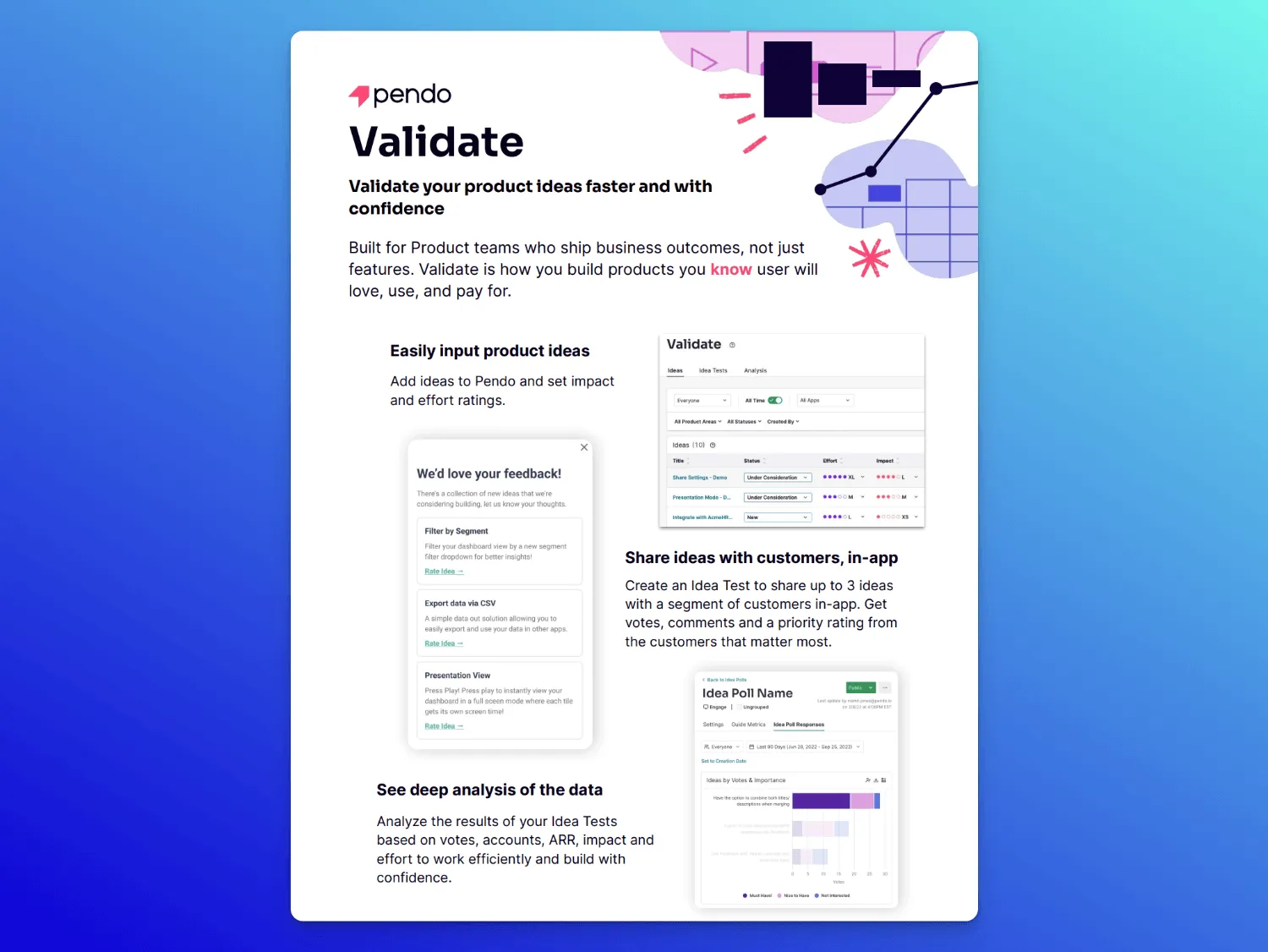
Use case: Top-of-funnel explainer best after intro calls or early-stage demos to clarify what the product does and why it matters
Audience: Heads of Product or senior PMs at mid-market and enterprise SaaS companies
Key components:
- Headline that clearly states the value of the tool
- Three-step visual workflow (idea input; customer feedback; data analysis)
- Minimal text, clean layout with distinct sections, a little pretty
- Short feature list paired with outcomes
- Clear CTA and “who it’s for” statement
What makes it great: This sales one-pager by Pendo keeps the message tight and focused on one pain: reducing product risk. The workflow is dead simple, and the clean layout makes it easy to scan and share.
2. Whistic security example
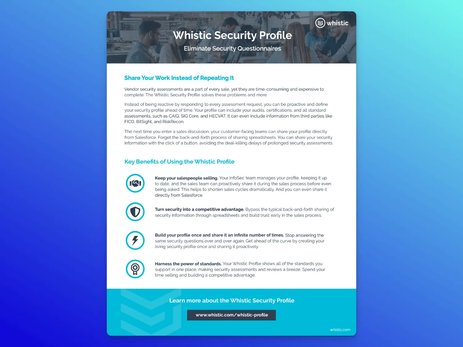
Use case: Proactively address security concerns and prevent deal delays - sent alongside (or just after) initial product conversations
Audience: Sales champions and deal supporters (like RevOps or enablement)
Key components:
- Direct headline that immediately names the pain
- Bulleted and clear value-first benefit headlines
- Feature-benefit pairings that tie to value-first headlines
- Clean, skim-able layout
- Distinct sections for pain, solution, and outcomes
- Messaging split by role
What makes it great: This one-pager example leads with what buyers actually care about: saving time, skipping friction, and getting deals through faster. It’s skim-able, practical, and confidence-building, without overloading (even with a lot of text).
3. Outreach product overview
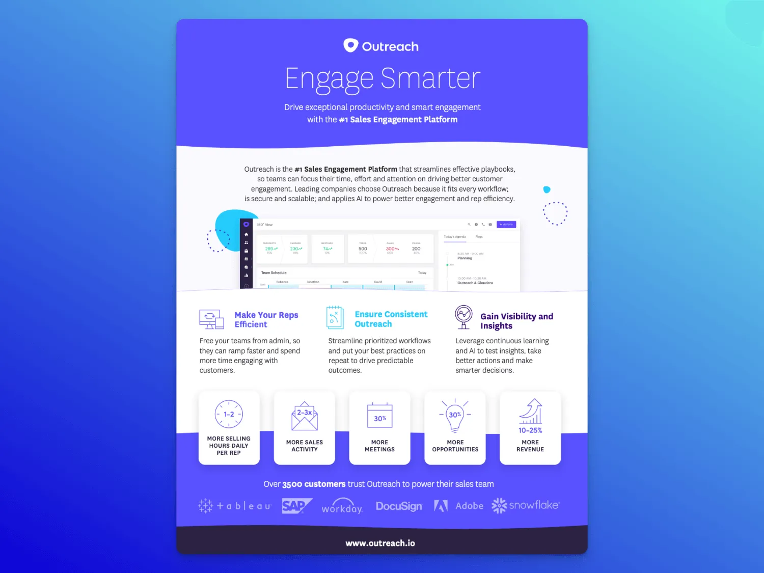
Use case: Early evaluation stage to introduce core value props and show great social proof
Audience: Revenue leaders (sales, sales ops, enablement) looking at sales engagement tools
Key Components
- Bold, benefits-first headline
- Short platform description that hits outcomes
- Dashboard graphic showcasing UI
- Three pillar benefits with easy-to-digest supporting copy
- Quick-view quantified outcomes with simple graphics
- Social proof via customer logo strip to build credibility and trust
What makes it great: This one’s clear, direct, and backed by social proof and metrics. You know exactly what Outreach does, how it helps, what kind of impact to expect, and who's gone before you.
4. Blameless build vs. buy comparison
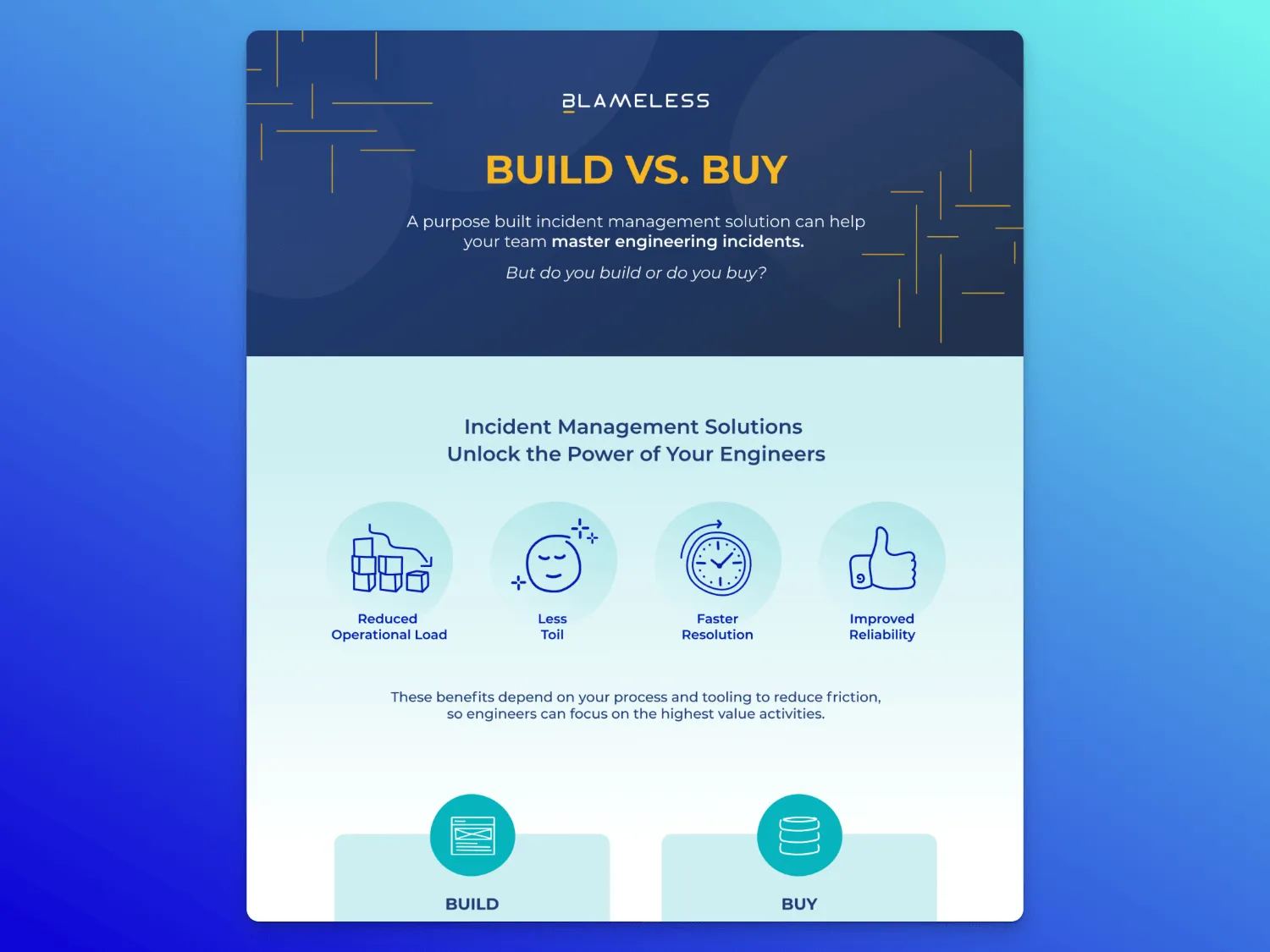
Use case: Help decision-makers consider the value of your solution against a DIY option
Audience: Engineering leaders, platform teams, and tech decision-makers
Key components:
- Side-by-side comparison chart that clearly outlines the pros and cons
- Bold icon-led benefits section
- Targeted callouts defining who it’s for
- Data-backed ROI framing
- Testimonial-style quote
- Distinct design sections with strong visual order
What makes it great: This sales one-pager doesn’t just pitch a product; it guides a decision. It’s clearly written for leaders who need help justifying a buy. The cost breakdown, side-by-side structure, and ROI framing make it feel less like marketing and more like a tool you’d reference.
5. Klue product one-pager
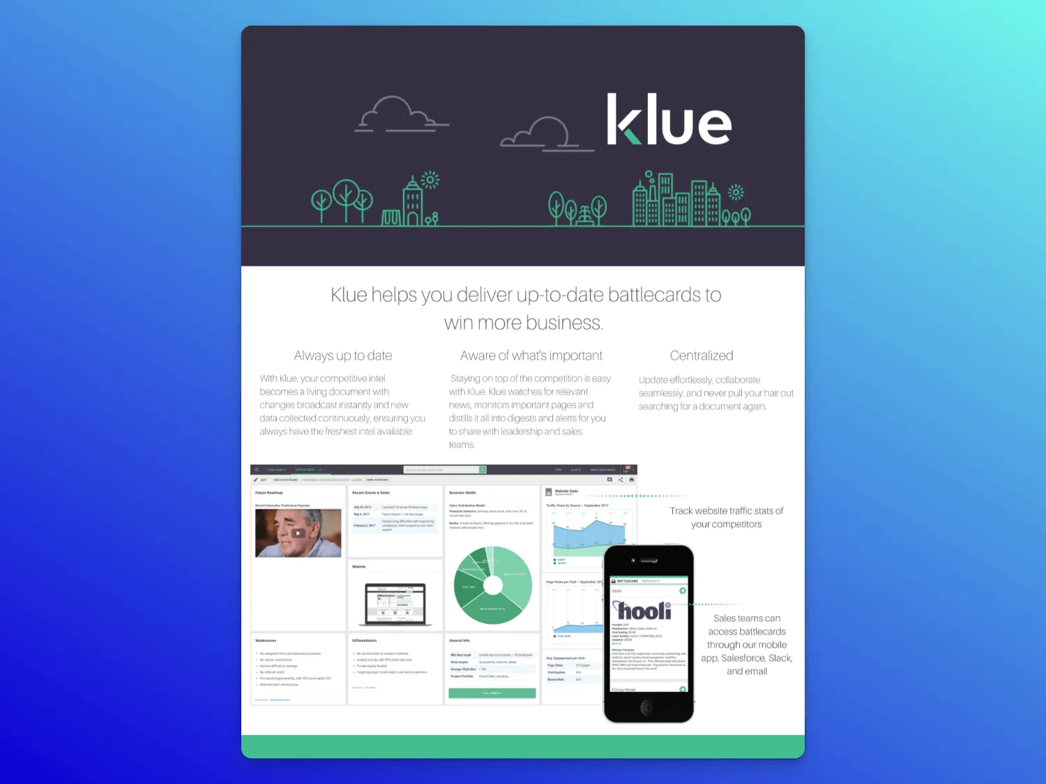
Use case: Early-stage sales enablement to give reps a quick, easy way to talk about how the product stacks up
Audience: Product marketers and sales enablement teams creating content to support reps
Key components:
- Value-led headline with a clear outcome
- Easy-to-skim benefit blocks
- Real dashboard UI with clear callouts so buyers see exactly what they’d use
- Mobile visual showing multi-channel access
- Bullet-point benefits make it easy to forward without losing context
What makes it great: Heavy on the UX, this one-pager skips overwhelming text in favor of visuals, including the desktop UI in action, mobile experience, and dynamic data pulled from Salesforce. And while it includes some benefit blocks, it's built for speed, prioritizing punchy takeaways for team members who don't have time to dig.
6. SoftwareSelect PPC pricing sheet
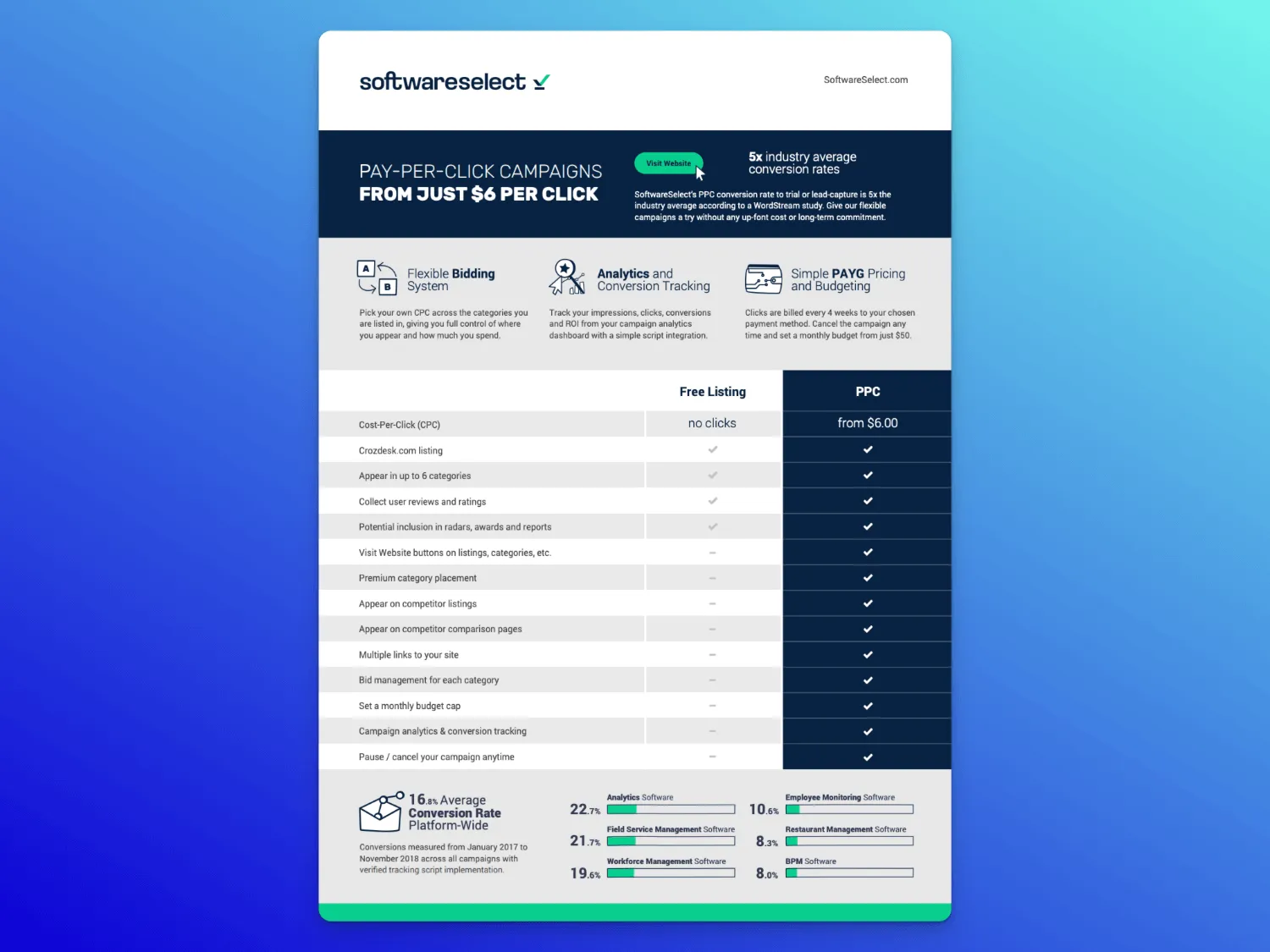
Use case: Mid-funnel decision support to help buyers compare plans. Great for use during pricing conversations or as a follow-up
Audience: Performance marketers or demand gen leads comparing options
Key components:
- Header with pricing hook and attention-grabbing metric
- Benefit-led icons that support value quickly
- Table with visual clarity: checkmarks, whitespace, and perfect alignment
- Side-by-side feature comparison clearly distinguishes free vs. paid
- Formatted conversion benchmarks to add trust
What makes it great: The layout of this one-pager does the work. A clutter-free side-by-side table makes the differences clear at a glance, while top benefits anchor the value. Rounding it all out are industry benchmarks with clear graphics that grab the eye without distracting from the value of the sheet.
7. Outreach infographic
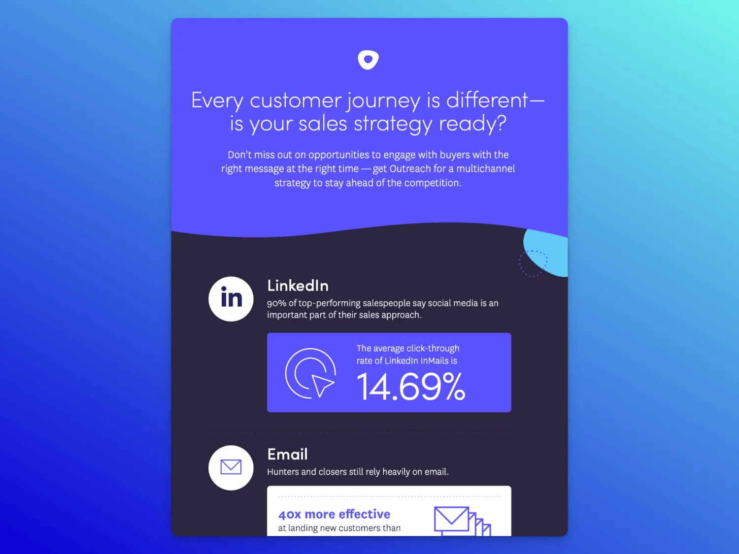
Use case: Strategic narrative support for sales teams, ideal for reinforcing POV and giving buyers a reason to change.
Audience: Leaders or internal champions who need to get buy-in on a new strategy that directly ties to a product
Key Components
- Opens with a challenge (“Is your sales strategy ready?”) to frame the message
- Each block includes a key stat with nothing dense, just 1 fact per section
- Lightweight copy with icons, company logos, and color contrast makes it easy to scan
- Backs up each channel with a proof point
- Ends with a summary stat that ties everything together
What makes it great: This is a great example of a strategy-first marketing one-pager. It doesn’t sell a product; it sells a mindset. Each section leads with a clear stat that’s easy to steal or share. If you're putting together a one-page explainer, this is a good reminder: you don’t need paragraphs of dense text. Clarity always wins.
8. Lattice product overview
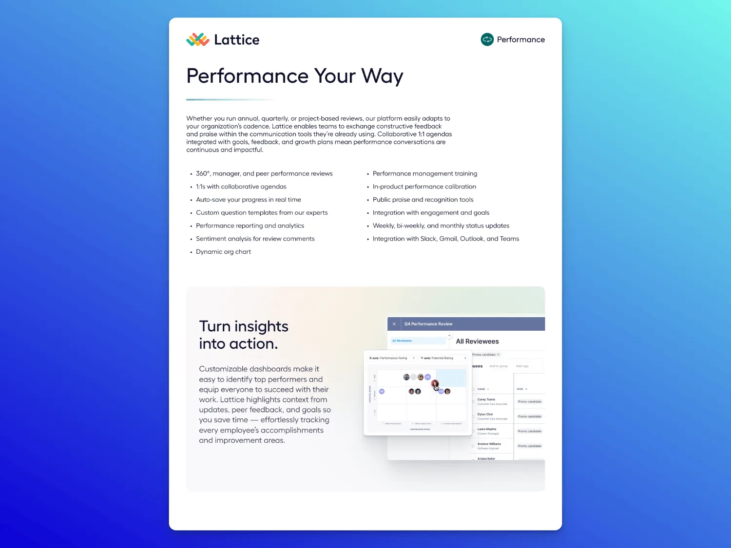
Use case: Early asset that does the lifting and explains the value, the why, and the "what's next" (without overwhelming)
Audience: Team leads and department heads responsible for evaluating new tools—especially when they might also be hands-on users or are trying to get buy-in
Key components:
- Sleek, brand-forward headline that centers on value to the reader
- Dense copy and features, but cleanly executed with bullets, immaculate font, and smart spacing
- Short, simple phrasing like "Turn insights into action" make benefits clear
- Clean side-by-side competitor comparison (oh, hi, $921K in time savings)
- Social proof with obvious logos like Slack, Reddit, Webflow, and Faire
What makes it great: This one isn't a try-hard. It's quietly persuasive, layering space and readability with just enough data to back it up. A good reminder that a one-pager doesn't actually have to be a one-page document; the comparison chart on page two gives additional info without the need for a separate follow-up asset.
9. MessageDesk solution overview
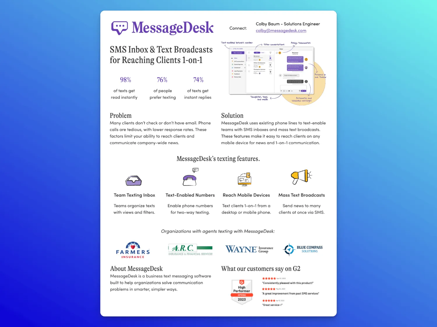
Use case: Credibility-building one-pager sent early in the sales process to show how the product solves a common pain point
Audience: Team leads or department heads responsible for external communications. Often in service, support, or operations
Key components:
- Problem and solution called out clearly with bold section headers
- Stats-heavy top row makes an immediate case
- Visual explanation of the product with screenshots
- Icon-driven feature summary (inbox, numbers, devices, broadcasts)
- Social proof stacked: recognizable logos and G2 reviews
What makes it great: This one-pager leans hard on trust. Between the name-drops, G2 quotes, and visualized product features, it gives buyers every reason to believe the tool works (and works for people like them). It's a great example of how to combine product clarity with social proof (when whitespace isn't the point).
10. Scale AI capability overview
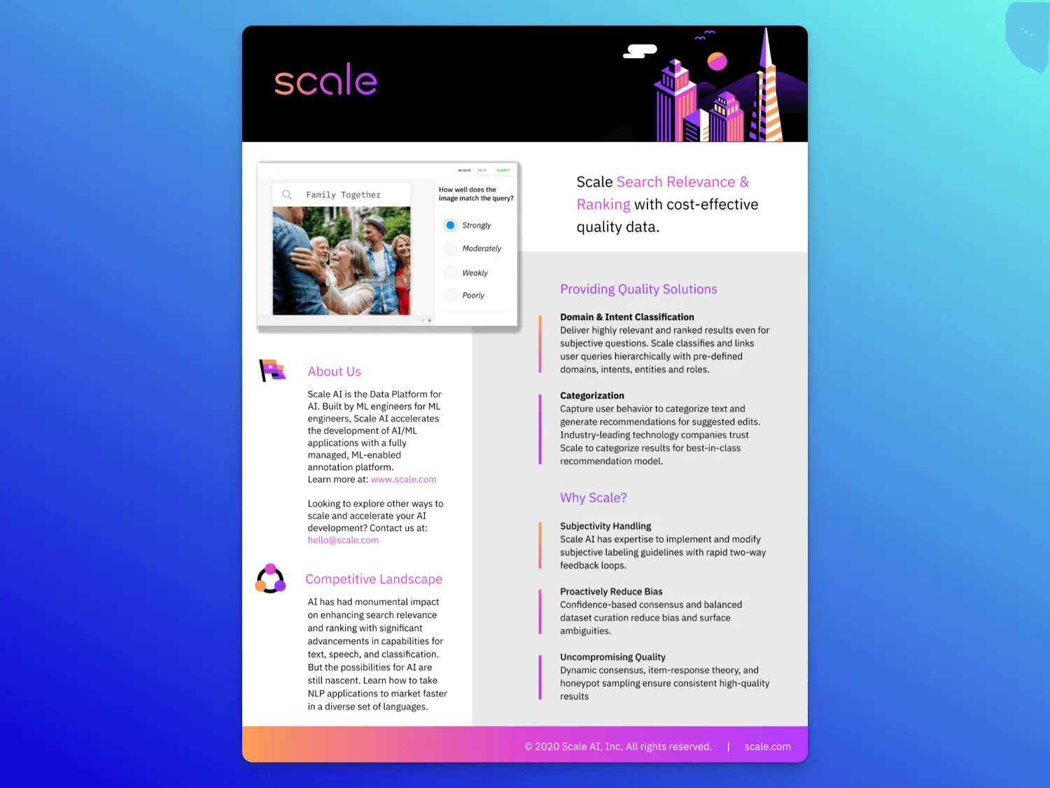
Use case: Early education or follow-up after a high-level conversation to introduce a complex product in a way that’s clear and visual
Audience: Technical decision-makers or internal influencers evaluating data infrastructure or ML tooling
Key components:
- Bold color palette and vertical layout that feels modern
- Strong headline with product value framed in impact terms
- Real product UI screenshot that anchors the technical value
- “About Us” and “Competitive Landscape” sections signal authority
- Modular capability breakdown (e.g., domain classification, categorization)
- “Why Scale?” section that reframes features as differentiators
What makes it great: This is a great example of how to make a technical product feel accessible. The color, layout, and real product visual build credibility, while the supporting copy makes a clear case for trust, quality, and sophistication. It’s a great example for teams selling anything with a complex backend that needs to feel uncomplicated.
11. 1Password strategy explainer
Use case: Top-of-funnel education or internal alignment content tied to a broader product-led motion.
Audience: People leaders, IT decision-makers, or security-adjacent stakeholders who want to promote a behavior shift
Key components:
- Immediate headline positioning the initiative as company-wide
- “Why it matters” block up top frames the stakes
- Clear visual segmentation of adoption phases with generous white space
- Icons paired with short, skim-able action steps
- Strong trust signals: G2 reviews, usage stats, and feature callouts
- CTA that ties the strategic message back to the product
What makes it great: This one-pager is all about clarity and momentum. It doesn’t just describe a problem. It outlines the steps to solve it. The structure is clean, the copy is short, and the visuals do the heavy lifting. It’s a perfect template for when you’re selling a behavioral shift that ties directly to product adoption.
12. ServiceTitan solution overview
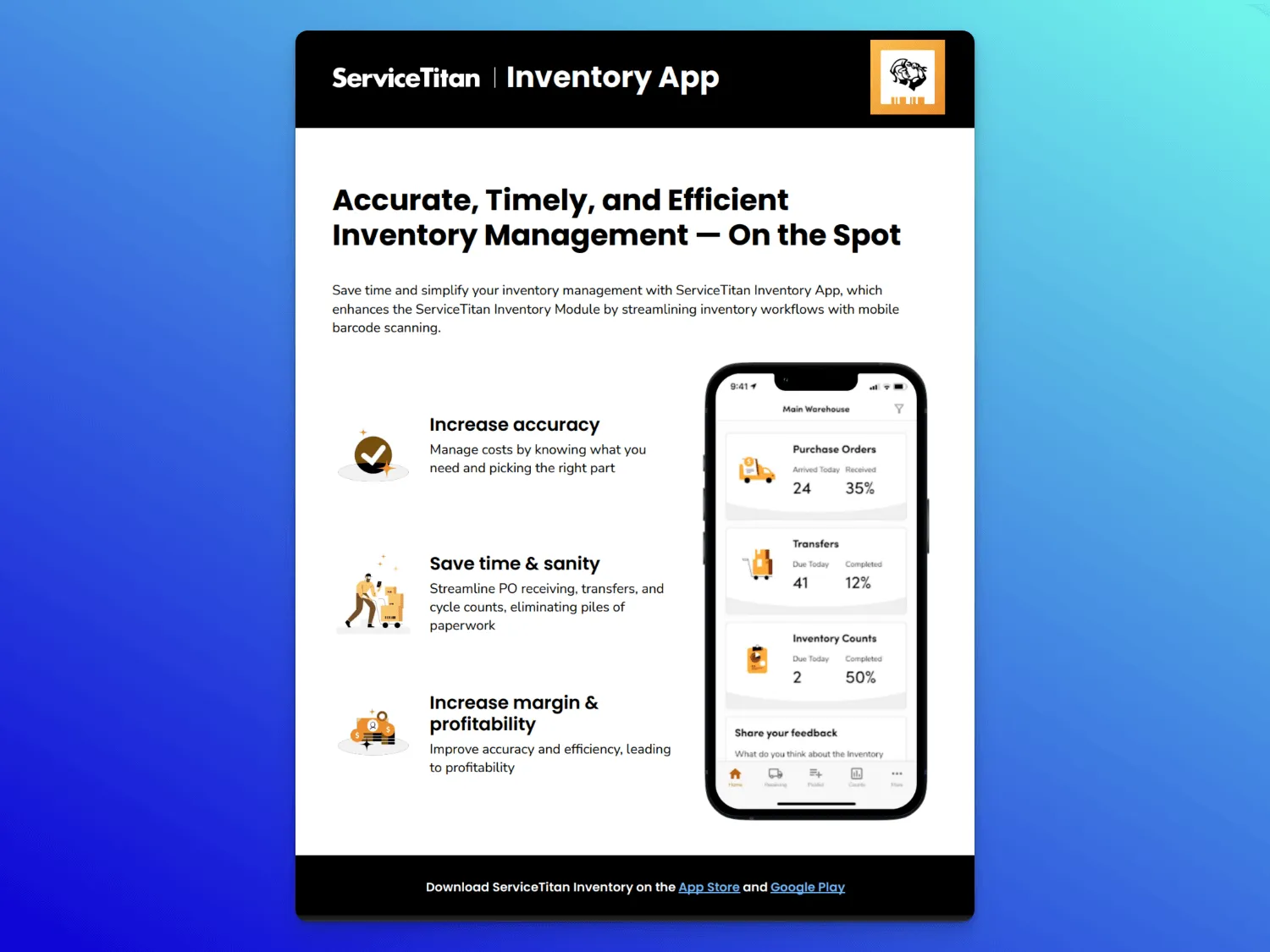
Use case: Intro to a product module or capability without needing a deep dive or custom walkthrough
Audience: Ops leaders, project managers, or finance buyers who oversee long-term jobs
Key components:
- Strong, benefit-first headline ties to outcomes
- Short, icon-supported feature blurbs for quick scanning
- Customer quote that grounds and adds social proof
- Page two expands value with clear headers, visuals of real docs, and more feature depth
- Key parts broken down into digestible sections
What makes it great: This sales one-pager leads with control and payoff. The copy is concise but still speaks to what buyers actually care about. More proof a one-pager doesn't just have to be a single page; a second page features real UI, industry-standard language, and a great testimonial.
13. 6sense ROI overview
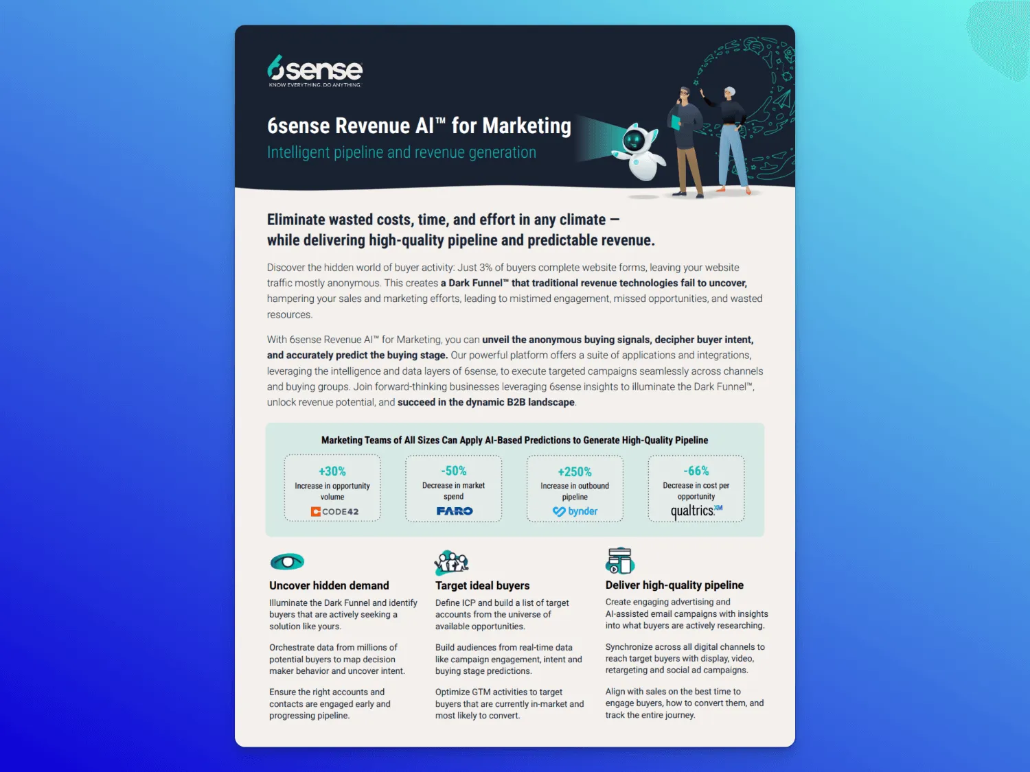
Use case: Helping buyers connect a big strategic idea to a concrete set of features and outcomes
Audience: Marketing and revenue leaders focused on pipeline quality, campaign efficiency, and cross-functional visibility
Key components:
- Outcome-first headline focused on predictability and high-quality pipeline
- Messaging hierarchy that walks through problem -> solution -> platform
- Three clear feature pillars with icons and visually balanced copy
- Case-study-style data (+250% outbound pipeline, –66% cost per opp) with branded logos
- Page two breaks down supporting functions with platform visuals
What makes it great: This effective one-pager showcases how to sell a platform and a POV. It anchors in the idea of the Dark Funnel, then proves its value with sharp copy, strong visuals, and brand-backed proof. The structure guides the reader: strategy up top, credibility in the middle, and product detail below. The final section offers additional company details and contact information (phone number) for anyone who wants to know more without distracting from the main point.
14. Hive Perform solution one-pager
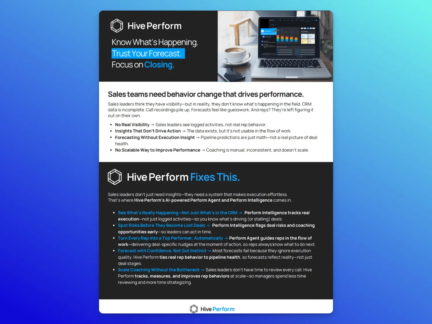
Use case: Feature overview that reframes a problem and walks readers through exactly how the product solves it (without needing a UI tour or dense feature list).
Audience: Sales and rev leaders responsible for improving team performance and driving process change
Key components:
- Punchy trio headline with high-level outcomes: Know. Trust. Close.
- Named pain points upfront with clear copy and visual contrast
- Problem/solution structure with clear line breaks and bold subheads
- Black-and-white box visual elements with digestible copy
- Side-by-side comparison grid and measurable customer results
What makes it great: This one-pager uses structure to tame density. It’s packed with content but cleanly broken into problem statements, solutions, and impact. The bold contrast layout gives plenty of breathing room to every section, and the measurable results page makes a confident close.
15. Threekit use case overview
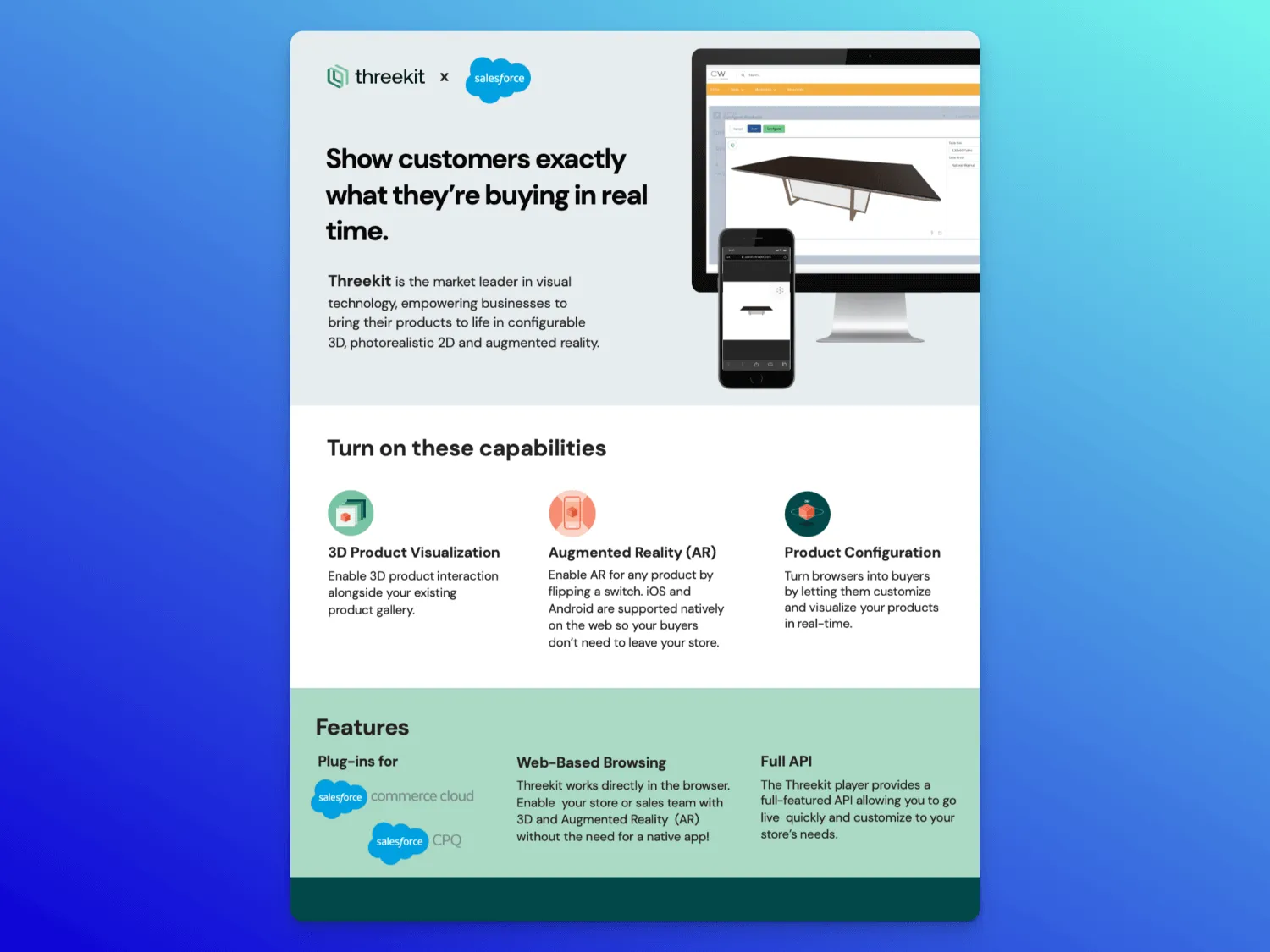
Use case: Early tech evaluation to explain what the integration enables and how it fits into their existing tools or workflows
Audience: Heads of digital product or ecommerce responsible for how products are sold
Key components:
- Value prop headline “Show customers exactly what they’re buying in real time”
- Brief product intro, plus a focus on visual formats: 3D, AR, product configuration
- Mockups showing both desktop and mobile views
- Three core element cards with icon and description
- Final feature row highlighting Salesforce integrations, browser access, and API support
- Color palette: muted green + light gray with coral and deep teal accent icons
What makes it great: This company one-pager doesn’t oversell. The simple layout, paired with product visuals and clearly defined capabilities, makes it easy to understand what the integration does without needing context from a sales call. It’s a great format for showing how a solution fits into existing workflows.
16. WordPress product overview
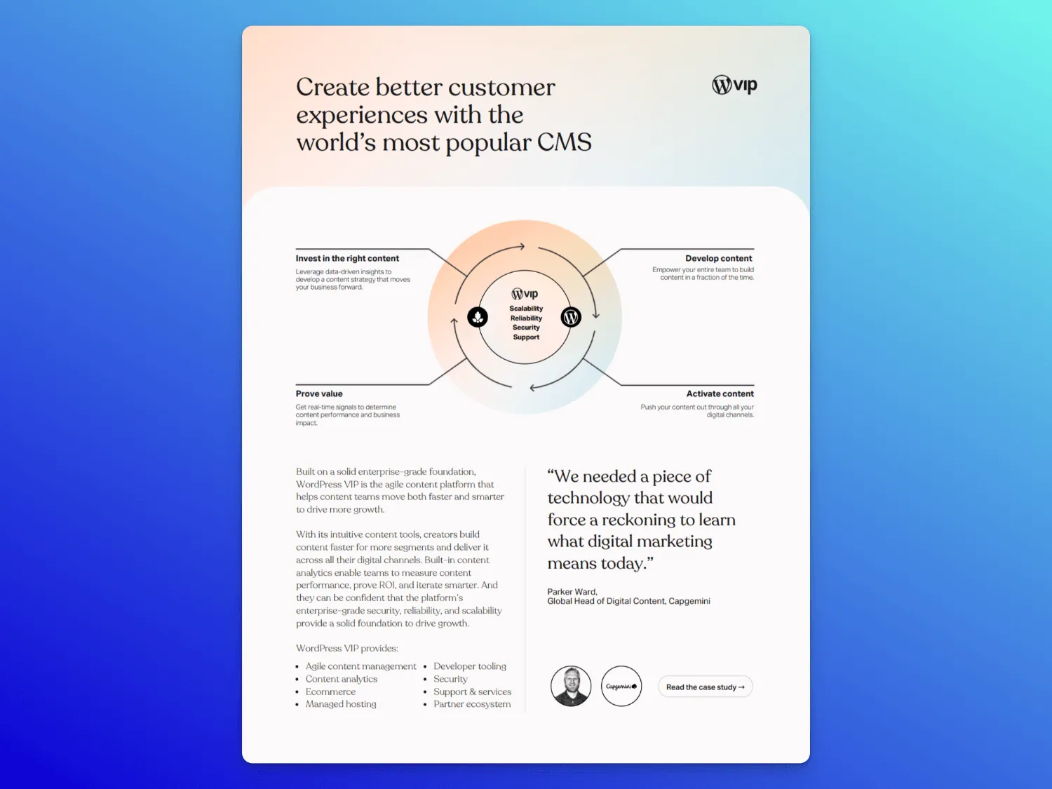
Use case: High-level product one-pager for early in the sales process to introduce the platform’s core value and build trust
Audience: Marketing and tech leaders looking for a CMS that can scale with enterprise needs
Key components:
- Editorial headline and copy establish tone and value
- Value flywheel graphic anchors a content strategy story
- Feature lists split cleanly across content, dev tools, analytics, and services
- Very clean logo grid builds trust with enterprise names
- Linked CTAs direct buyers to case studies, webinars, and security specs
What makes it great: This one just feels premium. The layout is thoughtful, the copy is tight, and the design choices (like a structured logo grid, flywheel diagram, and font) make it feel less like a sell sheet and more like a brand...moment. It’s a strong example of how to turn a product overview into something elegant and credible.
17. BONUS: TikTok for business overview
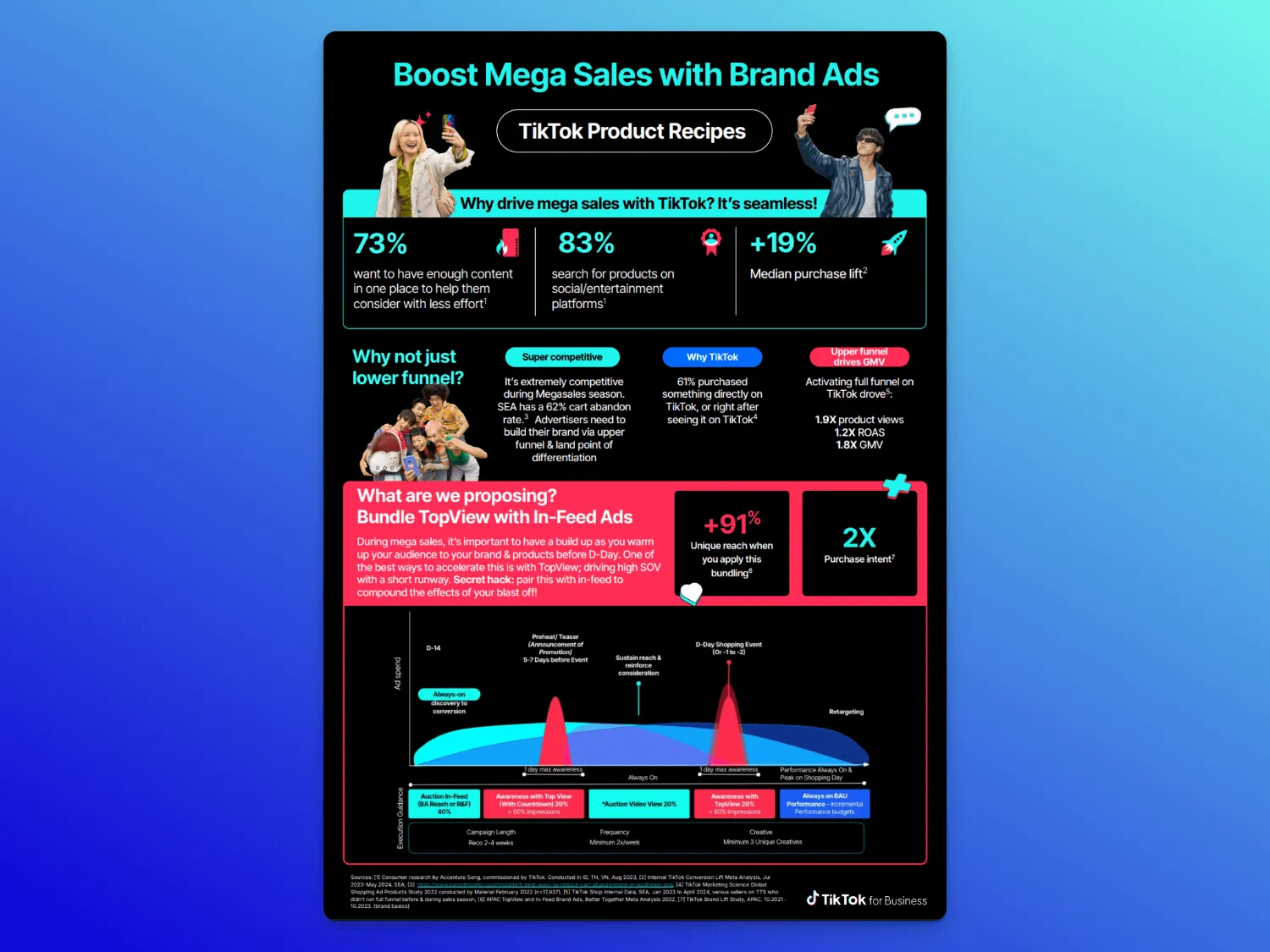
Use case: Campaign planning to help buyers align on media strategy, especially when selling a full-funnel approach during seasonal or high-stakes launches
Audience: Marketing teams or involved C-Suite decision-makers in a smaller company (think: startup) who need to connect a campaign strategy to outcomes
Key components:
- Leads with a clear POV: brand-led formats drive GMV and full-funnel results
- Packed with proof points: +91% reach, 2x ROAS, +16.7% ad recall
- Embedded social media case studies with full-funnel results
- Visual structure is bold and playful, but still data-heavy
- Messaging is confident, punchy, and filled with branded personality
What makes it great: At four pages, this isn’t technically a sales one-pager, but the format is worth stealing. It’s a sleek pitch deck that combines strategy, proof, and execution in one asset. If you're pitching a broader approach (not just a feature), this is a strong model for guiding buyers through the why, how, and what to expect, backed by data.
What to include in a sales one-pager
A sales one-pager isn’t just a clear, concise summary of your product or service. It’s a summary of why it’s the best solution to your customer’s problem.
A good sales one-pager is prospect-centric. Don’t just rattle off key points in the abstract. Tie them to specific customer pain and explain how your solution addresses them.
It should also be geared toward action. Beyond a basic CTA, give the reader everything they need to move forward. What do the next steps look like? How are they getting closer to solving their problem?
Through that lens, here’s the key information a sales one-pager should include:
- Essential information on your product or service: What does it do, and who is it for? What problem does it solve?
- Positioning and value proposition: What sets you apart from the competition? Why should someone choose you, specifically?
- Contact information: Who should the prospect reach out to for next steps? Include a specific rep (not a generic contact).
- Call to action: What should happen next for the deal to move forward? These can be more specific than “Contact us.”
Sales one-pager outline and template
Here’s how these categories break down into an outline. A good sales one-pager should make it easy for a prospect to understand your solution and take the next step—without needing more calls or follow-up emails. At a minimum, it should cover:
- Overview: A bold, outcome-focused headline or tagline, followed by a short value prop that speaks to the outcome, not just what you do. Include your rep’s contact info and a clear next step.
- What you do: Short copy or product cards that connect features directly to the prospect’s pain points. Make it skim-able—your buyer should get the gist in seconds.
- What makes you different: Share two or three unique differentiators that matter to your prospects. Instead of vague claims (“flexible,” “scalable”), focus on what your product does better (or differently) than your competitors or other alternatives.
- Pricing (optional): Share only what’s relevant for the stage of the deal, whether that’s a ballpark range or a personalized quote.
- Social proof: A logo strip, short testimonial, or case study link. Keep it relevant to their industry or role. This is about credibility, not clutter.
- Security and compliance: Certifications, policies, or links to FAQs that help remove IT/procurement roadblocks.
- Next steps: A clear call-to-action. Even better: a link to a mutual action plan so they can see exactly what happens after “yes.”
Or instead of relying on a one-pager to shoulder a huge sales burden, you can start from Dock's sales room template to give your prospects one link with all the information they need to choose yours solution.
One-pager uses by sales stage
Different deals require different content. Here's a quick breakdown of how one-pagers map to the sales cycle:
Sales one-pager best practices
If you’re tired of finding hacked-together one-pagers created by your sales team in Google Drive or simply don’t have time to start from scratch with every one-pager Slack request, here are 11 ways to make your one-pagers more scalable, shareable, and tailored to modern B2B deals.
1. Avoid the one-pager whack-a-mole
One-pager requests often come in vague and last-minute. To make things easier (and scalable), use a simple intake checklist:
- Who’s the audience?
- Stage of deal?
- CTA?
Build modular templates around common pain points and product solutions. Or just use Dock to templatize, version, and personalize these at scale without creating a new PDF every time.
2. Use prospect-centric messaging
Your prospect isn’t reading because they love you. They’re here to solve a problem.
Throughout any one-pager, make sure every line ties back to your target audience. Focus on your potential clients; their goals, pain points, or jobs to be done. You’re building a fast, focused argument for why your solution is the right fit.
This level of clarity is much easier to deliver with a personalized digital sales room (like Dock), where you can tailor one-pagers for each prospect instead of sending a static PDF.
3. Highlight your unique value proposition
Don’t just talk about what your product does; explain why it’s better than the alternatives.
- What makes you different?
- Why should someone choose you over a better-known name or lower-cost option?
A great one-pager surfaces your edge quickly and confidently (and often backed by quick takeaway stats or social proof).
4. Keep messaging product-led
Even though one-pagers are a sales asset, they should involve close collaboration with product marketing.
The idea is to avoid fluffy marketing speak and high-level discussion of benefits like “save time and resources.” Instead, you’ll be super clear and specific on which features your product will use to solve pain points.
5. Educate, don’t oversell
B2B buyers don’t need hype; they need help making good decisions.
A strong one-pager doesn’t push. It informs.
- Explain the problem
- Show how your product solves it
- Back up your claims
- Give enough context for someone to feel confident sharing it internally
6. Match the buying stage
A TOFU one-pager should look very different from the onboarding preview sent right before contract. The B2B customer journey isn’t linear.

Earlier in the deal, keep things light: high-level value, product overview, key differentiators. Closer to close? That’s when you add deeper comparisons, pricing, onboarding or implementation details, or objection handling.
7. Optimize for shareability
PDFs are reliable but also limited. They’re easy to lose, hard to update, and completely un-trackable.
Dock digital sales rooms are a more modern and scalable way to to organize your one-pagers in a central, trackable workspace where buyers can find everything they need. You’ll also be able to see who’s viewing them and when, and they can ask questions or get clarification directly in the workspace.
8. Ditch static PDFs when personalization matters
PDFs are familiar, but they weren’t built for modern sales cycles. If your one-pager needs to evolve with the deal—or if you’re customizing them for different buyers—they can quickly become a pain to manage.
Sales deal rooms give you a more flexible way to organize and share content. Instead of sending versioned PDFs, you can update content in real time to create a more personal experience for every prospect.
9. Track engagement
One of the biggest problems with PDF one-pagers: you have no idea if anyone reads them. They aren’t trackable.
But engagement can be a serious buying signal. If people are opening and engaging with your one-pager regularly, that implies the deal is being considered.
Using a sales room instead of a PDF will give you visibility into which contacts are looking at your sales content and when.
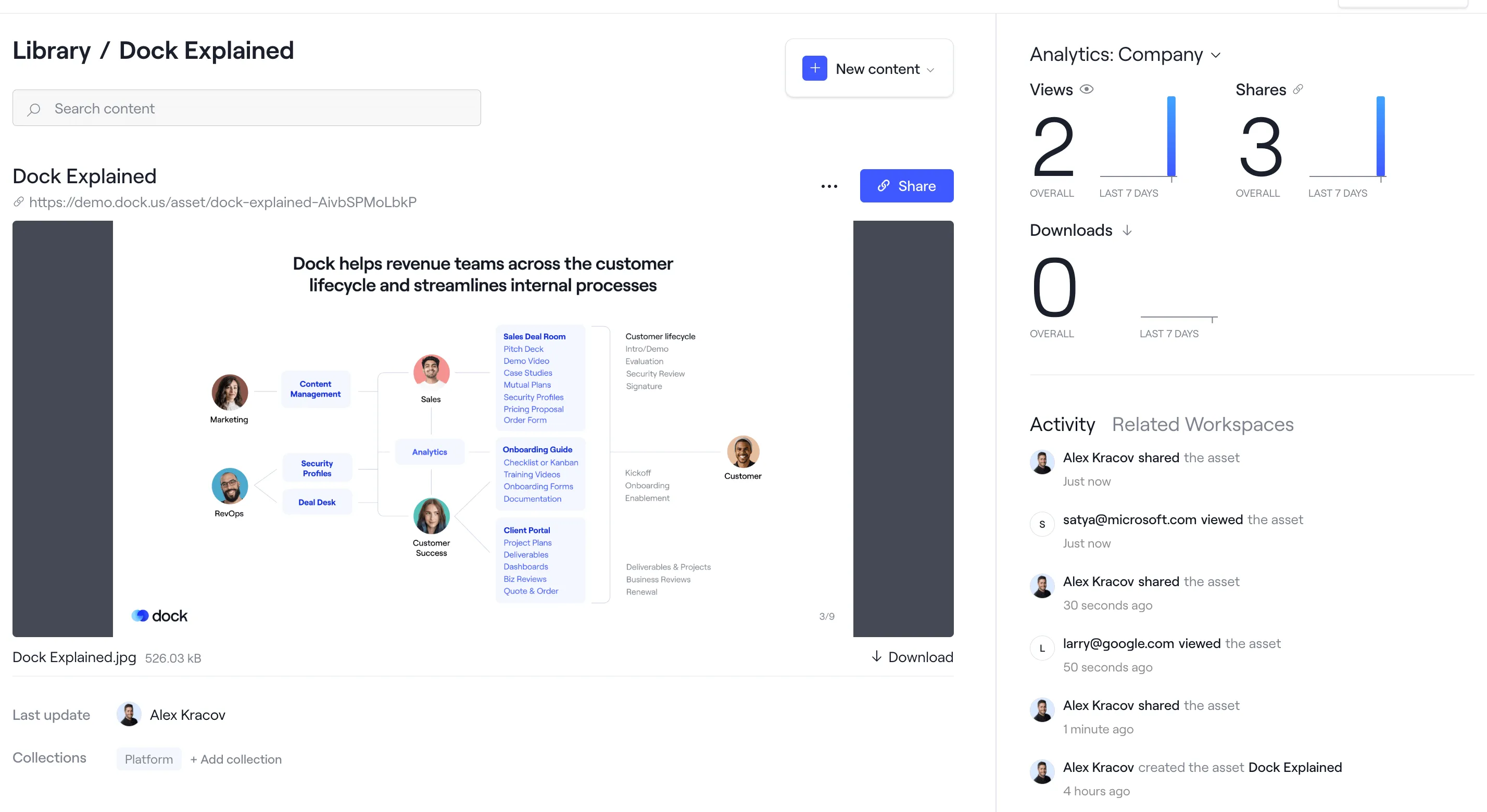
Or, if you’re really set on using a PDF, you can upload it to Dock’s content management platform and share it with a trackable link that gives you full content analytics:
10. Keep it scannable
Don’t overload the page. Break your message into chunks, use headers and whitespace, and highlight only what matters.
Your prospect should be able to get the gist in 10 seconds and the key takeaways in under a minute. If they have to read it, you’ve already lost them.
11. End with clear next steps
Good content marketing tells the reader what to do next. Don’t leave them wondering.
Make sure your one-pager ends with a clear call to action, think: “book a call,” “view the pricing,” or “check out the demo.” Even better: include a mutual action plan so everyone knows what happens next.
Ditch static one-pagers for Dock
Even the best business one-pager is only a static document. There’s no reason to constrain yourself to a static file in 2025.
With a Dock digital sales room, you can share everything that would go in your one-pager—but in a more organized, dynamic, and trackable way.
You can create up to 50 workspaces in Dock for free—so it's free to try. Or if you’d rather talk to our team, you can schedule a demo today.


Related Revenue Lab Articles


Templates for Sales, Onboarding,
Projects and Portals
Customize and share with clients


