


At some point in every serious B2B deal, the energy shifts from excitement to scrutiny.
The demo is over. Now the deal moves into evaluation—and your champion has to bring in security, IT, finance, and operations. The technical stakeholders who weren’t in the first few calls.
That’s usually when your champion asks for a product datasheet—or some asset with technical specs.
Some teams call them “sell sheets,” which frankly oversells what they actually do. By the time this document shows up, the buyer isn’t looking to be sold. They’re looking to validate.
A product datasheet should help technical stakeholders assess fit—and help your champion defend the decision internally.
Buyers are asking practical questions: Will this integrate with our stack? What exactly do we get at each tier? Is this secure enough for IT? Has a company like ours done this successfully before?
A strong datasheet answers those questions before they’re spoken. It anticipates objections and gives your champion something credible to circulate when you’re not in the room.
The format hasn’t changed much over the years (a “product datasheet” sounds like something straight out of a filing cabinet in 1994). But the role has. A modern product datasheet isn’t about generating interest. It’s about removing hesitation in late-stage deals.
So we pulled together 18 real examples from companies selling complex products, and broke down what makes them effective—and what you can borrow for your own sales assets.

Want to see our full archive of curated B2B sales assets?
Check out 200+ examples of sales decks, one-pagers, battlecards, and more in The Revenue Archives.
Our 18 favorite product datasheets
We’ve boiled down each of these product datasheets into a three‑part micro‑teardown you can scan in under a minute:
- Overview: A snapshot of the audience the asset targets and the specific how-it-works gap it fills.
- The hesitation killers: The specific diagrams or sections that proactively answer a buyer’s unnamed questions to remove doubts and accelerate decision-making.
- The takeaway: One actionable design or copy move you can lift straight into your own sales assets.
1. OpenText partner datasheet
OpenText’s datasheet targets system integrators and implementation partners who sell or deliver OpenText Content Management (Extended ECM) projects. The sheet’s core job is to clarify how delivery works once a customer signs, mapping services to real project phases and helping partners understand where OpenText steps in.
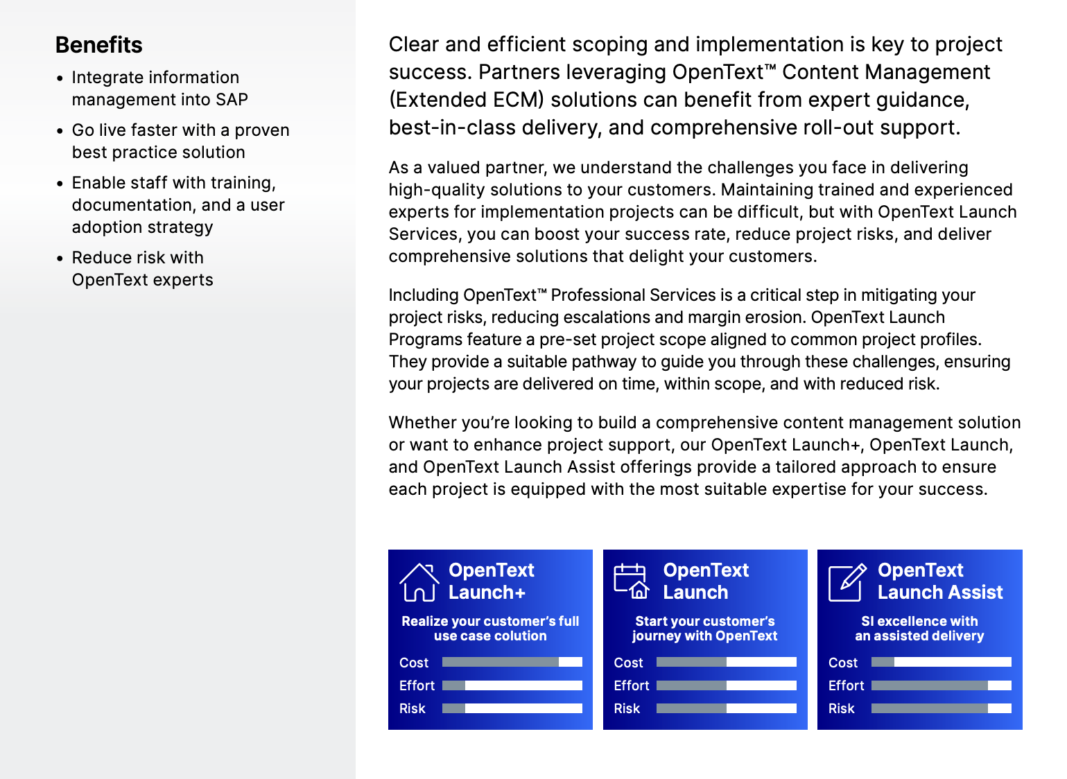
The hesitation killers:
- On page one, simple visual bars proactively answer a partner’s most urgent internal question: Which model fits my current project's budget and team capacity?
- On page three, a detailed checklist breaks down exactly what is included in each tier; this kills the scope creep hesitation by defining exactly where the vendor’s responsibility ends and the partner's begins.
- The document includes a dedicated case study from a leading HCM system integrator who migrated 12,000 employees; seeing a peer praise the "attention to detail" and "deep technical expertise" addresses the fear that bringing in the vendor might complicate the project.
💡The takeaway: Use comparative visualizations for service tiers. If you offer different levels of implementation or customer support, create an at-a-glance visual that maps out the trade-offs between cost, speed, and risk; this helps your champion make a faster decision without reading every line of the technical scope.
2. Software Select PPC product datasheet
Overview: Software Select’s one-pager targets SaaS marketing managers and growth leads looking for high-intent traffic sources beyond the typical Google/Meta duopoly.
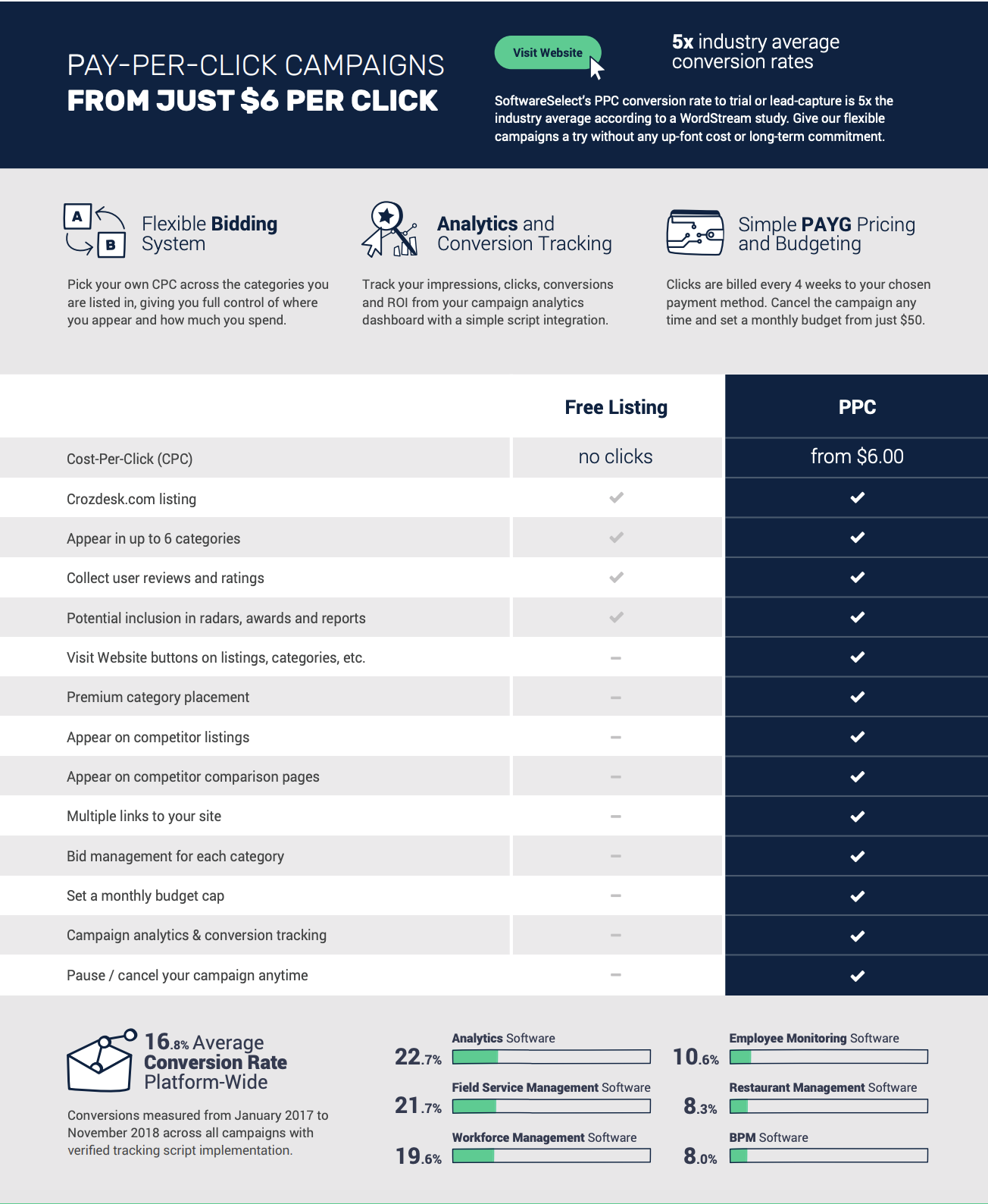
The hesitation killers:
- The sheet explicitly addresses budget concerns by highlighting "no up-front cost or long-term commitment" and the ability to cancel at any time.
- Instead of just claiming high conversion, the footer provides a granular breakdown of average conversion rates across specific software categories like analytics (22.7%) and field service management (21.7%).
- The middle table contrasts "Free Listing" with "PPC" to show exactly what a buyer is missing out on. By checking off items like "Appear on competitor listings" and "Multiple links to your site," it triggers a fear of being left behind by competitors who are already using these premium placements.
💡The takeaway: If you’re selling performance-based services, lead with industry-specific benchmarks. While high-level statistics are fine, showing a prospect the specific conversion rate for their category is far more persuasive.
3. Docusign Pharmaceutical product datasheet
Overview: Docusign’s sheet targets operations and compliance leads at life sciences firms who are navigating the high-pressure drug development cycle. The job is to show how Docusign fits across the entire pharmaceutical value chain while staying compliant with FDA and global regulatory standards.
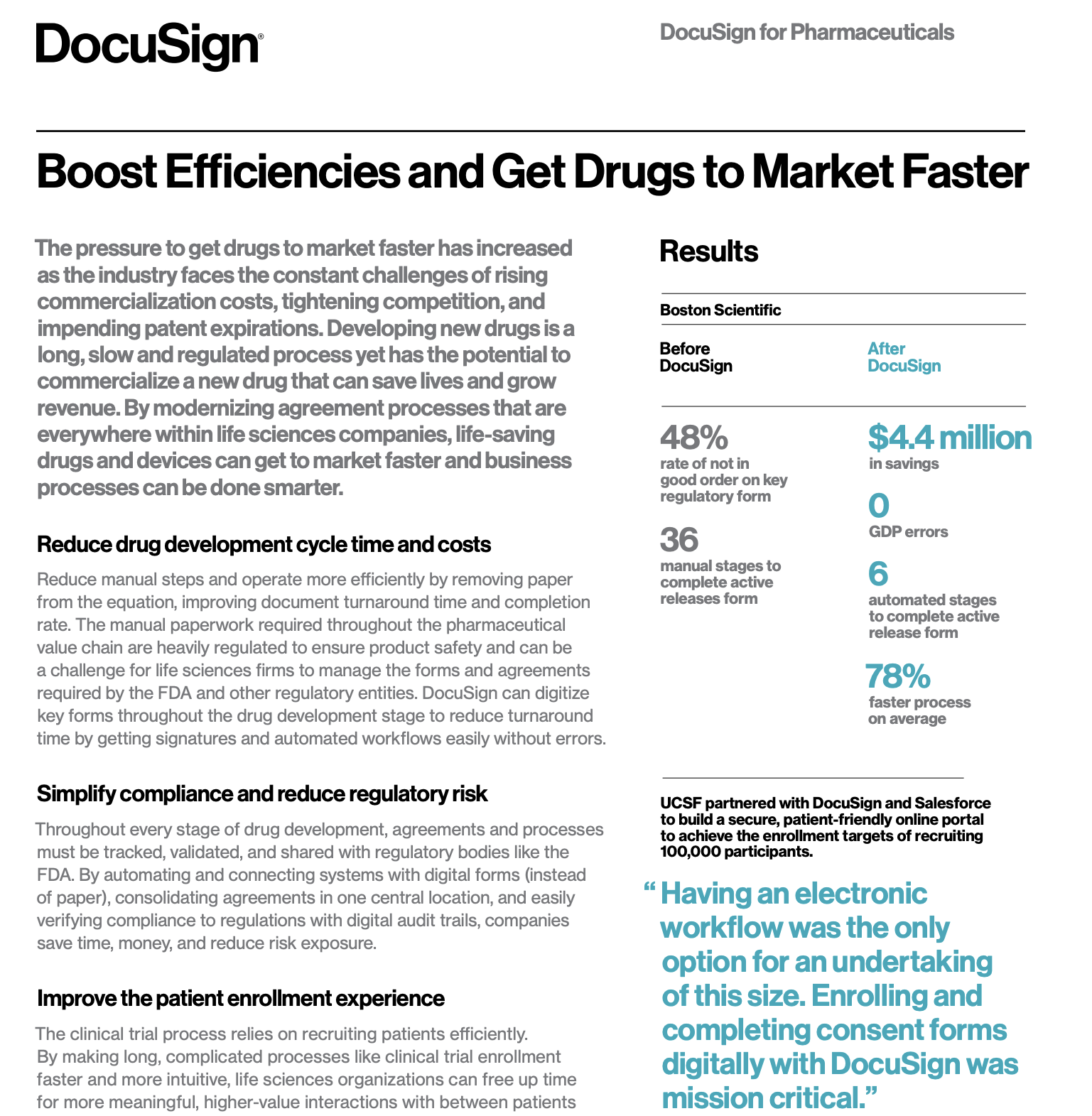
The hesitation killers:
- For pharmaceutical buyers, non-compliance is a deal-breaker. Docusign kills this hesitation by highlighting a dedicated module designed specifically to meet electronic record and signature requirements for the FDA (US), EU, and Japan.
- The before-and-after metrics (e.g., 78% faster processes, and $4.4M in savings) give internal champions something concrete to take to leadership.
- Statements like “12 of the top 14 pharmaceutical companies globally use DocuSign,” paired with quotes from AstraZeneca and Boehringer Ingelheim, address an unspoken concern: is this proven at our scale?
💡The takeaway: When selling into highly-regulated industries, lead with your compliance certifications. Put your regulatory stamps of approval front and center to build immediate trust with technical and legal evaluators.
4. Klue Battlecards product datasheet
Overview: Klue’s asset targets product marketers, sales enablement leaders, and RevOps teams who struggle with stale competitive intel and low battlecard adoption. The job is to show how Klue turns battlecards into a living, continuously updated system that sellers can access and use mid-deal.
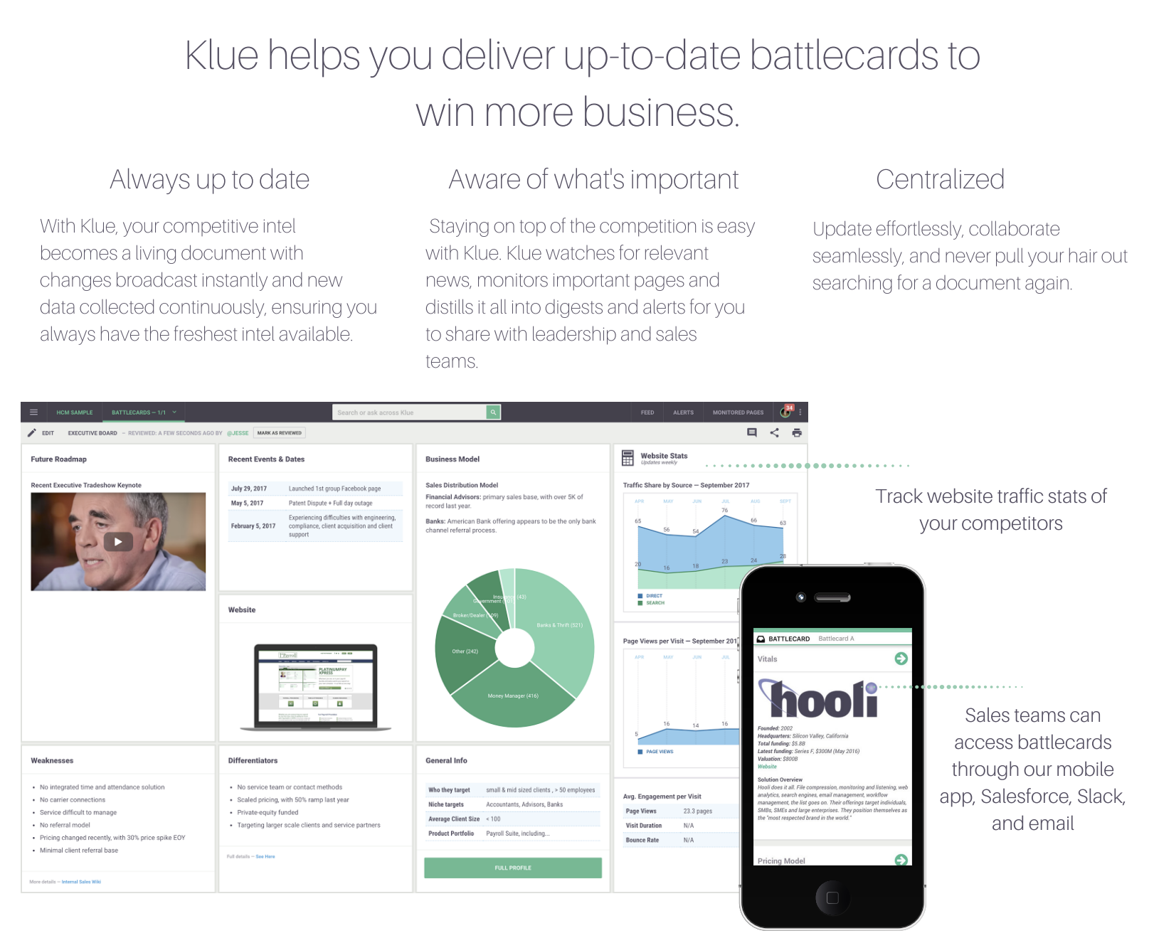
The hesitation killers:
- A major hurdle for enablement tools is adoption. Klue kills that by explicitly stating that battlecards can be accessed where reps already work: Salesforce, Slack, email, and a mobile app.
- On page two, the datasheet shows how the platform pulls in automated data cards for employee growth and operating metrics, proving the software does the heavy lifting of data collection.
- By calling out custom text, tables, videos, charts, and automated data cards in the same breath, the asset reassures teams they won’t be stuck choosing between rigid templates and free-for-all docs.
💡The takeaway: If your product solves a maintenance problem, show the automation in action. Show the dashboard components and the integration points (like Salesforce or Slack) that keep it that way.
Competitive battlecard examples
Competitive battlecards are another sales enablement asset that are notoriously hard to find, but we found 24 for you.
5. ChartMogul and Recurly joint product datasheet
Overview: This datasheet targets RevOps teams and finance operators dealing with fragmented revenue data. The asset positions the pair as complementary infrastructure for subscription growth, not overlapping software.
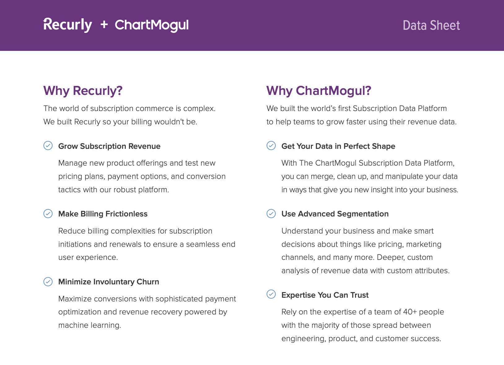
The hesitation killers:
- On page two, the document separates the value propositions for both Recurly (billing frictionless-ness) and ChartMogul (advanced segmentation). This kills the hesitation of "Why do I need both?"
- For teams wary of small startups, the sheet calls out ChartMogul’s 40+-person team,with a heavy focus on engineering and product.
- Messy subscription data is treated as inevitable rather than as user error. Language like “connect, merge, or even edit customer and billing data manually” signals flexibility and control, which matters to operators who’ve been burned by rigid analytics tools that can’t handle edge cases.
💡The takeaway: When your product relies on an integration, sell the joint value as a single solution. Don't list two separate products; show how they work together to solve a specific, high-stakes problem like data fragmentation.
6. Huawei AR1200 Series Enterprise Routers product datasheet
Overview: Huawei's datasheet targets network engineers, IT architects, and procurement teams evaluating enterprise-grade routing hardware for branch offices. The asset’s job is to provide exhaustive technical detail: throughput limits, port configurations, supported protocols, interface cards, licensing options, and deployment diagrams; so buyers can validate exact fit within complex network environments.

The hesitation killers:
- The datasheet proactively addresses longevity concerns by highlighting architectural decisions designed to prevent performance bottlenecks as network demands grow.
- Pages 5-6 feature four sample deployment diagrams that remove the imagination tax for architects.
- Pages 6 through 8 provide high-density hardware and software matrices that let technical reviewers quickly validate supported configurations and edge cases without needing a follow-up call.
💡The takeaway: Legacy datasheets like Huawei’s get technical rigor right, but often at the cost of accessibility. Keep the depth, but layer it with plain-language summaries and clearer structure so non-engineering stakeholders can still participate in the decision.
7. Rippling Security Program product datasheet
Overview: Rippling’s security datasheet targets security teams, IT leaders, legal reviewers, and enterprise buyers evaluating Rippling as a system of record for sensitive employee and company data.
The hesitation killers:
- Early on, Rippling spells out that security isn’t everyone’s job; naming frameworks like ISO 27001 and NIST 800-53 signals maturity and gives security reviewers immediate reference points they trust.
- The datasheet outlines how data is encrypted, how access is controlled, and how sensitive fields are handled differently.
- Security leads often worry about internal threats; Rippling addresses this with a "People Security" section that details a solid interview process, mandatory annual info-sec training, and rigorous third-party background checks.
💡The takeaway: If your product handles sensitive product information, try to de-risk the decision as much as possible. Rippling’s example shows how to balance depth with clarity: lead with ownership and standards, explain controls in plain language, and document failure scenarios honestly.
8. Rippling Password Management product datasheet
Overview: Rippling’s RPass datasheet targets IT admins, security teams, and technical buyers responsible for protecting company credentials at scale. The job here isn’t to convince buyers why password management matters—they already know that—but to explain how Rippling’s RPass works under the hood, so security reviewers can sign off with confidence.
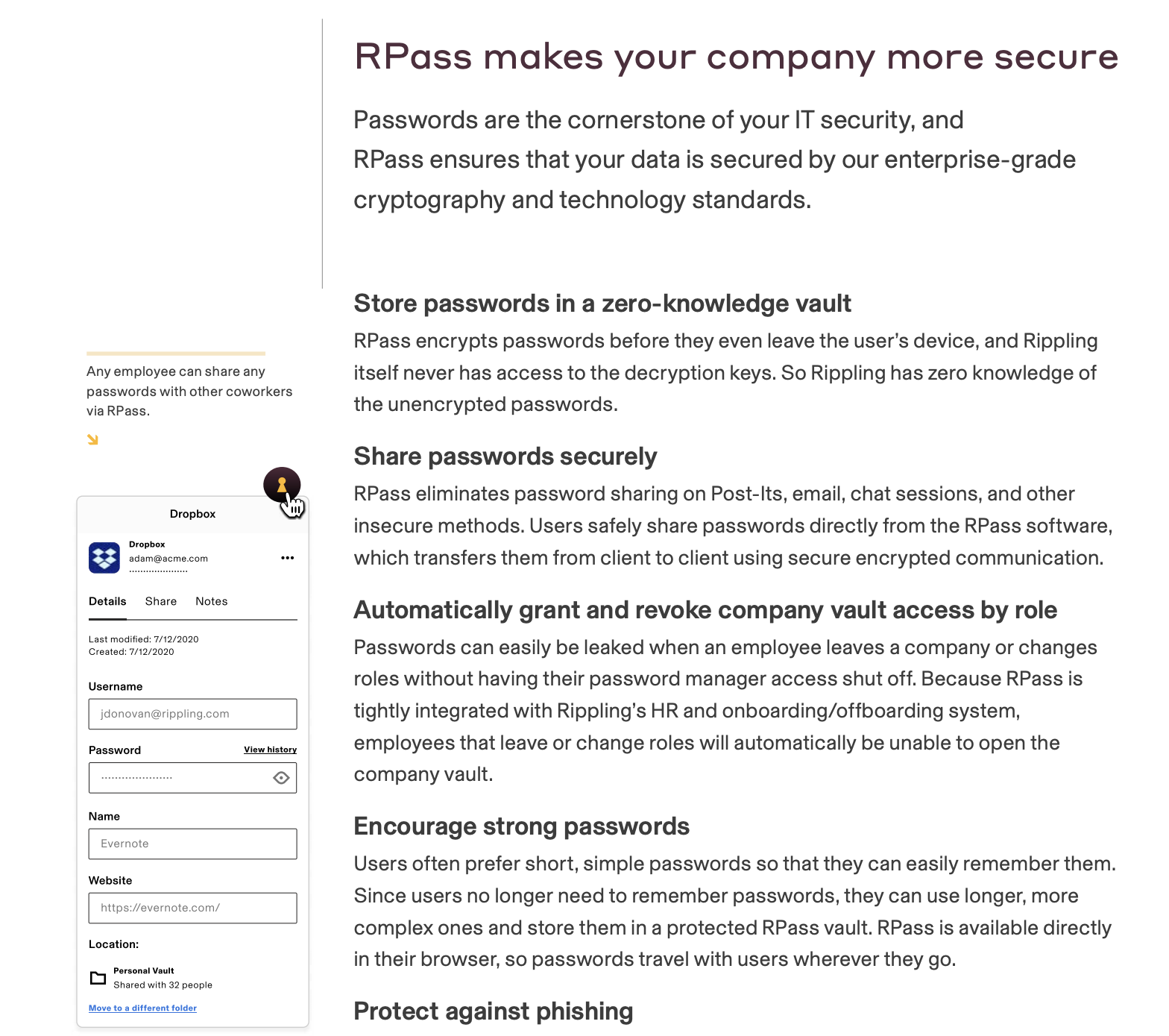
The hesitation killers:
- A primary security concern for leads is vendor data breaches, but Rippling addresses this by detailing its zero-knowledge architecture.
- The datasheet explains how Rippling removes access automatically when employees change roles or leave, closing a common security gap without extra administrative work.
- Instead of treating encryption as a black box, entire sections walk through the cryptographic model in plain steps, explaining how keys are generated, stored, and shared. This gives security reviewers enough transparency to validate the architecture themselves.
💡The takeaway: When selling a security product, provide the how for the what. Use technical diagrams and algorithm descriptions to prove your architecture follows industry standards.
9. ChartMogul product datasheet
Overview: This datasheet is for RevOps leaders, finance teams, and SaaS operators who already understand subscription metrics and want to know exactly what they can analyze with ChartMogul.
.png)
The hesitation killers:
- The datasheet lists every major metric ChartMogul supports across leads and trials, recurring revenue, churn and retention, cohorts, cash flow, subscribers, and forecasting.
- The cross-functional relevance is made clear; the breakdown spans sales management (pipeline, win value), finance (cash flow, forecasting), and product/CS (retention, cohorts).
- By showing that the platform can map quarterly retention and net MRR retention, it proves to the buyer that they can identify exactly where their leaky bucket is.
💡The takeaway: If your product generates a lot of data, provide a menu of insights. Categorize your charts so each stakeholder can find the specific data points that matter to their role.
10. Zuora for High Tech product datasheet
Overview: Zuora’s datasheet targets high-tech SaaS and platform companies shifting to “anything-as-a-service” (XaaS) models. The asset focuses on how Zuora can support pricing and packaging experimentation, retention analysis, and end-to-end order-to-revenue automation at scale.
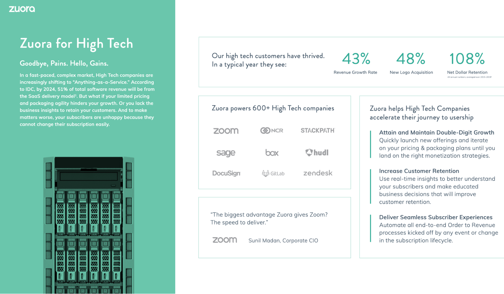
The hesitation killers:
- The asset includes a wall of logos featuring heavy hitters like Zoom, Box, and Zendesk to reinforce social proof.
- One of the biggest hurdles for technical buyers is the perceived effort of implementation—Zuora addresses this by highlighting its no-code and low-code developer tools, promising that teams can customize and extend the suite without a massive engineering overhaul.
- Zuora calls out specific subscription metrics like NDR, MRR, trends analysis, and positions them as tools for decision-making; this reassures finance and RevOps teams that retention improvement is measurable and actionable inside the platform.
💡The takeaway: For vertical-specific datasheets, prioritize relevance over exhaustiveness. Zuora’s High Tech example works because it maps platform capabilities to the exact growth levers that matter in that industry (pricing agility, retention metrics, and process automation)—then backs those claims with credible, segment-level data.
11. Zuora product datasheet
Overview: Another datasheet by Zuora targets enterprise IT and Finance architects responsible for scaling subscription businesses beyond the limits of product-centric legacy systems.
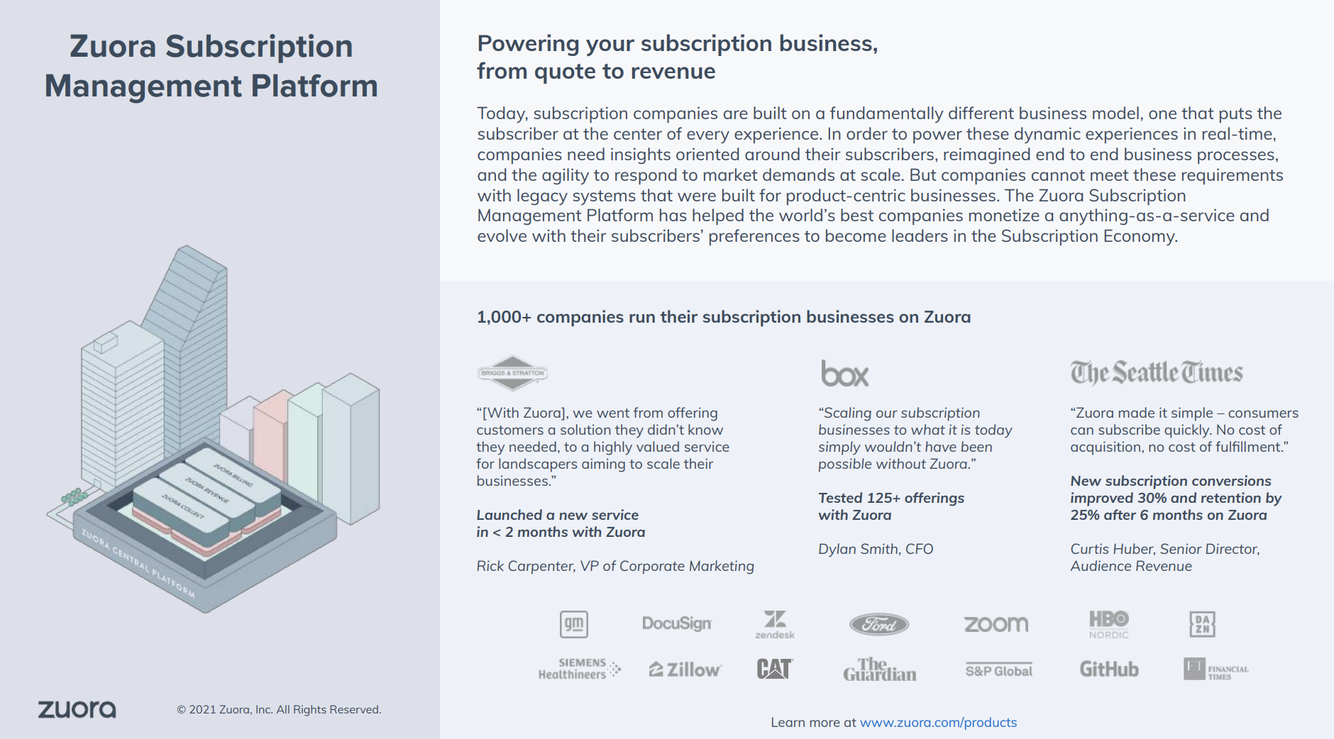
The hesitation killers:
- The opening page anchors Zuora’s legitimacy with scale signals: 1,000+ companies, recognizable logos, and concrete customer outcomes; this reduces early-stage vendor risk before buyers dig into key features.
- The datasheet repeatedly emphasizes automation over manual work—an appealing benefit for anyone.
- Visual product screenshots and architecture-style illustrations sit alongside short, scannable descriptions, allowing executives to skim for reassurance while giving technical and finance stakeholders enough detail to keep reading.
💡The takeaway: When selling infrastructure, target the “imagination tax” of legacy systems. Show the pre-built models and AI-driven automation that replace the manual work your buyers are currently doing.
12. Salesforce Health Cloud product datasheet
Overview: Salesforce’s datasheet targets healthcare providers, payers, life sciences companies, and health systems evaluating whether Salesforce can support patient-centric workflows while staying compliant with healthcare data standards.
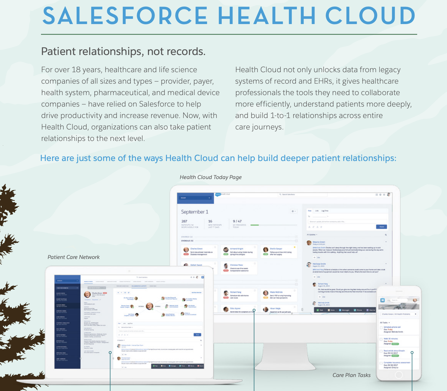
The hesitation killers:
- The primary hesitation for health systems is the cost and complexity of connecting to old records—Salesforce addresses this by explicitly highlighting EHR integration and HL7-compliant interfaces built on FHIR standards.
- For healthcare buyers, data security is non-negotiable; the datasheet proactively introduces Salesforce Shield, an add-on that provides platform encryption, event monitoring, and field audit trails.
- The feature set on page two organizes Health Cloud, Service Cloud, and Shield capabilities into a clear hierarchy; this visual structure helps buyers understand how the pieces fit together, reducing cognitive load.
💡The takeaway: In regulated industries, great datasheets reframe the category. Salesforce Health Cloud works because it names the buyer’s core fear (generic CRM is not patient care), then methodically proves fit through standards, data models, and clearly scoped layers of capability and compliance.
13. Salesforce Marketing product datasheet
Overview: Salesforce’s marketing datasheet targets senior marketers and marketing leaders inside large organizations who are already bought into Salesforce, or are evaluating it as a long-term platform.
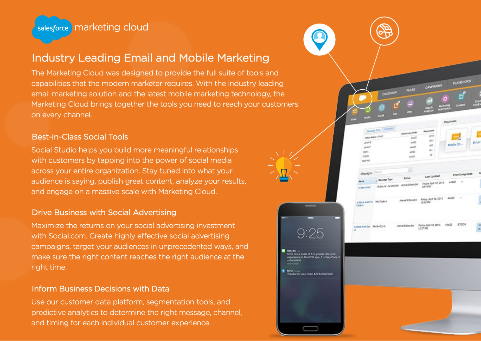
The hesitation killers:
- Instead of deep feature specs, Salesforce lists every major cloud and capability marketers can tap into—Marketing Cloud, Pardot, Analytics, Community, Heroku, AppExchange—showing that whatever problem arises next, it likely already lives inside the ecosystem.
- Salesforce relies on journey storytelling (“The New Customer Journey,” “Internet of Customers,” “1:1 experiences”) and consumer-app metaphors (Analytics Cloud compared to Yelp and Uber), which reduce intimidation for non-technical marketing leaders who might otherwise disengage.
- By emphasizing point-and-click tools and infinite extensibility, Salesforce reassures buyers they won’t outgrow the system, even if they can’t articulate those future needs yet.
💡The takeaway: When selling a platform with dozens of features, categorize them by jobs-to-be-done (JTBD). Salesforce groups them into "Listen and Analyze" or "Connect and Engage" buckets to help potential buyers see how the technical features translate into a marketing strategy.
14. HubSpot & LinkedIn product datasheet
Overview: This joint datasheet targets B2B marketing leaders, demand gen teams, and RevOps stakeholders who already use HubSpot and are evaluating whether LinkedIn Ads should be a first-class, deeply integrated channel.
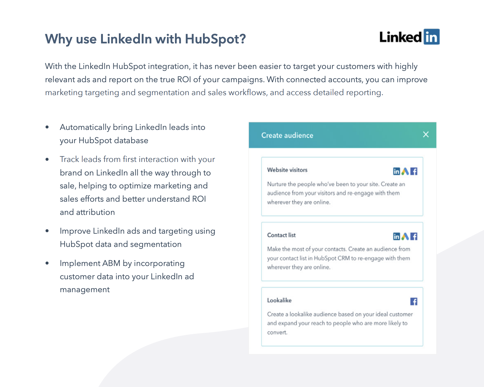
The hesitation killers:
- The datasheet explicitly promises full-funnel visibility, from first LinkedIn interaction through closed-won revenue. Pages 1 and 3 repeatedly emphasize “true ROI,” “full-funnel reporting,” and the ability to compare LinkedIn ads against other channels, directly tackling the fear that paid social impact can’t be proven.
- The document spells out exactly what happens once accounts are connected: LinkedIn leads sync automatically into HubSpot, get de-duplicated, scored, and added to a unified contact timeline.
- The datasheet shows that campaigns, audiences, exclusions, and notifications can be managed directly inside HubSpot—interface screenshots reinforce that this is an embedded workflow buyers can picture using day-to-day.
💡The takeaway: If you’re selling an integration, document the data flow. Show exactly what syncs and how it changes reporting and decision-making downstream.
15. Salesforce Event Monitoring product datasheet
Overview: This technical datasheet targets chief security officers, IT directors, and Salesforce administrators who need granular visibility into how their data is being accessed and used.
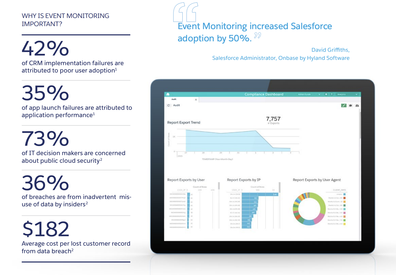
The hesitation killers:
- The datasheet explicitly lists the questions leaders are already asking: What are users actually doing? Are we getting value from the platform? Are users complying with security policies? That mirrors internal conversations and reassures buyers.
- Page two breaks the system into three steps—capture, visualize, act—detailing exactly what’s logged, how long data is retained, how it’s accessed, and where it can be analyzed.
- The table shows which teams typically own Event Monitoring—IT, security, or audit—so buyers can quickly see who this product is meant for internally.
💡The takeaway: For governance and security products, a strong datasheet makes risk visible and actionable. Explain how that data helps the buyer provide better support and manage compliance.
16. 1Password Enterprise product datasheet
Overview: 1Password’s datasheet targets IT security leaders and CISOs who need to secure thousands of employees without sacrificing productivity. The core job of the asset is to move 1Password out of the consumer-friendly password manager bucket and position it as foundational security infrastructure.
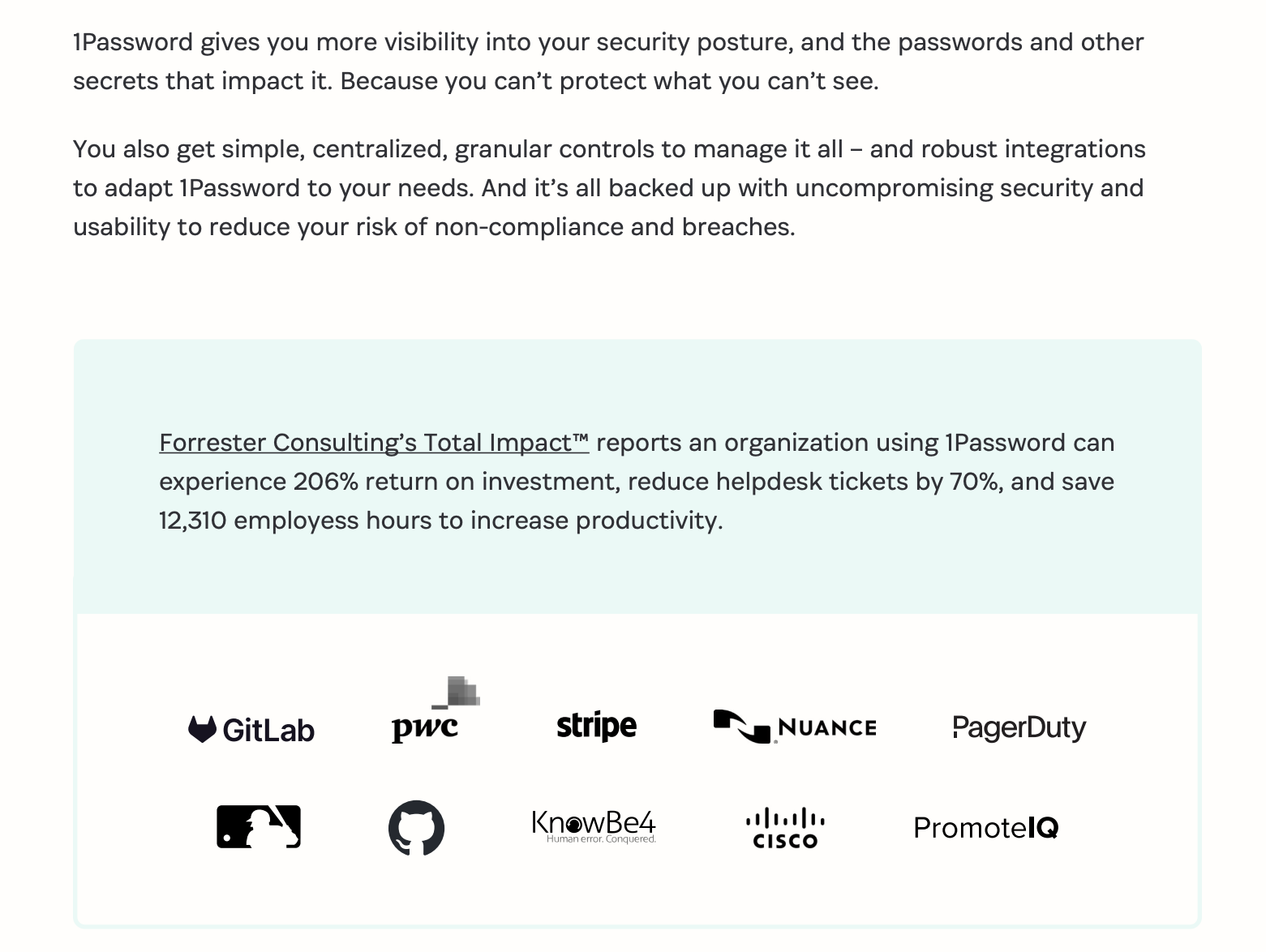
The hesitation killers:
- Instead of hand-waving around encryption, the datasheet walks through how 1Password’s dual-key model works: an account password plus a 128-bit Secret Key that’s never stored on 1Password’s servers.
- SOC 2 Type II, GDPR, and CCPA compliance are listed plainly, alongside third-party audits and an unusually transparent security posture.
- The datasheet spells out exactly what admins can see and do. This directly counters the concern that password managers trade control for usability.
💡The takeaway: When selling to the enterprise, quantify the relief. Use specific metrics—like "12,310 employee hours saved"—to show that your technical solution is a massive productivity multiplier for the entire organization.
17. Docusign Notary product datasheet
Overview: Docusign’s Notary datasheet targets legal teams, operations leaders, compliance-heavy industries (real estate, finance, healthcare), and organizations that rely on notarization as part of critical workflows.
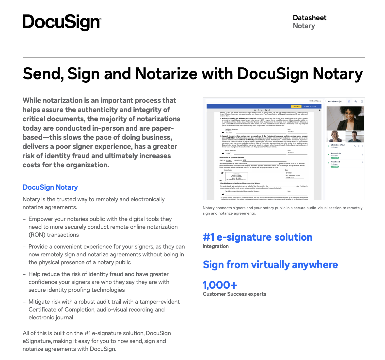
The hesitation killers:
- The datasheet explains how trust is maintained: secure audio-visual sessions, identity proofing, tamper-evident Certificates of Completion, electronic journals, and full audit trails.
- The copy repeatedly emphasizes convenience: sign and notarize remotely, no physical presence required, sign from virtually anywhere.
- Many buyers worry about fragmented workflows; this asset kills the hesitation by showing how Notary is built directly on the Docusign eSignature platform.
💡The takeaway: If your product digitizes a legacy manual process, focus on the security of the move. Prove that your digital version is actually more secure and auditable than the paper original through automated identity checks and tamper-evident seals.
18. Scale
Overview: Scale AI’s datasheet targets machine learning engineers and technical leaders responsible for moving computer vision models from proof of concept to production. The core job of this asset is to explain how Scale supports the full ML lifecycle.
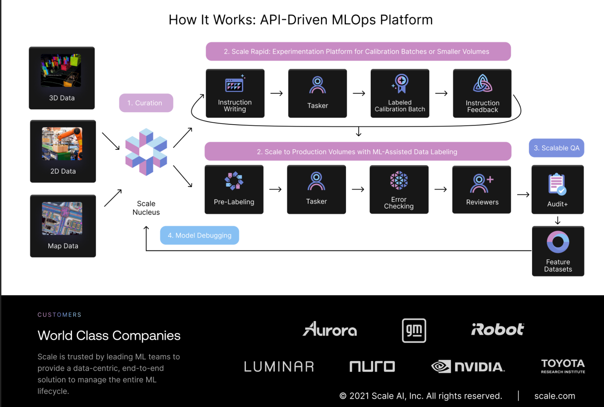
The hesitation killers:
- Early on, the datasheet calls out real problems like edge cases, uneven data, and model drift to show that Scale gets what breaks ML projects in production.
- Logos from companies like Toyota, NVIDIA, GM, and Aurora reinforce that this platform is already trusted in high-stakes, production-grade environments.
- A stage-by-stage visual shows how ML teams move from concept to production, helping buyers understand where Scale adds value now and later.
💡The takeaway: Map your product’s capabilities to maturity. Scale’s datasheet works because it helps buyers self-identify where they are today and see a clear path forward.
What makes a great product datasheet?
First, let’s reset expectations: a product datasheet isn’t meant to persuade someone to want your product—it’s meant to help them decide whether it fits them.
The strongest product datasheets do a few things exceptionally well.
1. They prioritize the scan-to-signal ratio
Your buyers are looking for specific capabilities, like API access, SSO, user permissions, or reporting depth.
- Use a capability matrix: Instead of a wall of text, use a clean table that lists features alongside the specific business function they serve.
- Highlight core pillars: Group features into logical buckets (e.g., security, analytics, workflow automation) so different stakeholders can quickly find what matters to them.
- Tier transparency: If you have multiple pricing tiers, clearly mark which features are "Pro" vs. "Enterprise" to manage expectations early.
- Use a spec table: Organize core technical information into a clean, bordered table.
2. They translate tech-speak into customer-speak
A great datasheet explains the impact of a feature to bridge the gap between what the software does and what the user achieves. So:
Don't just say: "SOC2 Type II Compliant."
Do say: "SOC2 Type II Compliant to ensure your enterprise data meets global security and privacy standards."
Don't just say: "Open API."
Do say: "Open API for effortless data syncing between your CRM and tech stack."
3. They provide visual proof of the interface
In SaaS, the interface is oftentimes the product. If the buyer can't see it, they can't imagine using it.
- Use focused screenshots: Use cropped, high-quality images of specific high-value views (like a custom report builder or a mobile interface).
- Incorporate workflow diagrams: Use a simple flow chart to show how data moves within and outside the system.
- Pull up integration logos: Include a visual section featuring recognizable logos (Slack, Salesforce, AWS) to prove the software fits into their current ecosystem.
4. They empower your internal champion
Your primary contact has to sell this to their boss or a different department. Make it easy for them to champion your product when you aren't in the room.
- Draft your one-sentence pitch: Include a clear, bold header that summarizes exactly what the product does in plain English.
- Include proof points: Add one or two short value statistics (e.g., "reduces manual data entry by 40% on average").
- Make your product datasheet ridiculously easy to share: Your champion has to recreate your magic for their stakeholders; often without you there to guide them. If you provide them with nothing but a static PDF, you’re forcing them to do the heavy lifting. This is where the delivery of your datasheet becomes just as important as the content itself. Use a digital sales room like Dock to transform a flat datasheet into an interactive resource hub.
Take it from Jules Aldag, Senior Go-To-Market Enablement Manager at Lattice, who jokes:
"We all know it works so well to say, 'Here's 50 slides you can pull from…'"
In reality, giving a rep (or a buyer) too many scattered assets creates a manual and hard-to-track mess. Jules realized that if an enablement resource isn't easy for an Account Executive to use in their actual workflow, it won't be used at all.
Lattice shifted from sending individual PDFs and slide decks to using Dock to build flexible digital deal rooms. This allowed their reps to personalize the experience for every champion, whether they were sharing a simple product one-pager after a first call or a complex business case during final negotiations.
The result: By moving away from "50-slide dumps" and into personalized, digital workspaces, Lattice increased their win rates by 25% using Dock.
Move out of datasheets and into Dock
In a world where 78% of buyers prefer to self-educate on their own schedule, how you hand off information is just as critical as the data itself.
If you want to enable your champions and make your product’s technical specs feel like a premium experience, Dock’s your move.
Here are a few ways to get started:
- Sign up for Dock: Your first 50 client workspaces are free.
- Upload your datasheets to the content Library.
- Add your datasheets to a deal room: Use our Digital Sales Room Template to embed your product datasheets alongside recap videos and pricing cards to help your champion steer the deal forward.
Want to more great examples of sales enablement assets?
The Revenue Archives rounds up the real assets teams use every day: ROI calculators, sales decks, onboarding tools, testimonial videos, and more.
Product datasheets FAQs
What is a product datasheet?
A product datasheet is a concise document that outlines the essential information a buyer needs to evaluate a product. This typically includes technical specifications, key capabilities, requirements, limitations, and product details that help potential customers decide whether the product is a fit.
Product datasheets are commonly used across B2B ecommerce, manufacturing, and by distributors who need consistent, accurate product information they can pass along to customers or partners.
Note: A datasheet, unlike a marketing brochure, is built for evaluation; it’s often printable, structured with clear sections and bullet points, and designed so technical and non-technical stakeholders can quickly find what they need to make an informed decision.
You’ll sometimes hear datasheets referred to as a fact sheet or sell sheet. The terminology changes, but the job stays the same: reduce uncertainty during the buying process.
How to make a product datasheet?
Good datasheet design prioritizes scan-ability. Use headings, tables, and bullet points instead of dense paragraphs. If you need to go in-depth, structure the document so readers can skim first and dive deeper only where needed.
At a minimum, it should include:
- The product name and a plain-language summary on the first page.
- Core product specifications and requirements.
- Supported use cases, integrations, or environments.
- Honest notes on limitations or trade-offs.
- Visuals such as diagrams or product images where they add clarity.
- A clear call-to-action (CTA) and contact information for next steps.
Many teams start with a product datasheet template, but the best ones are customized by the audience: technical buyers, security reviewers, or business stakeholders don’t all need the same level of detail.
For teams managing large catalogs, datasheets are often generated or maintained through a product information management (PIM) system to keep specifications, naming, and formatting consistent across channels.
When it’s time to share those datasheets with customers, sales rooms like Dock make it easier to package and deliver them with the right context.
What is the difference between SDS and product data sheet?
An SDS (safety data sheet) is a regulated document focused on chemical safety, handling, storage, and hazard information. The document is legally required in industries like manufacturing, chemicals, and pharmaceuticals.
A product datasheet, on the other hand, focuses on product details, functionality, and technical fit.


Related Revenue Lab Articles

.webp)
.webp)


Templates for Sales, Onboarding,
Projects and Portals
Customize and share with clients


