


According to Salesforce, you have 30 seconds to hook your audience with your sales deck. If you’re here, it probably means your current deck isn’t quite landing that punch.
Maybe the narrative in your deck feels flat, or your visuals aren’t helping prospects carry the story forward. The data backs this up: personalized content boosts average reading time by 41% and is shared internally 2.3× more often.
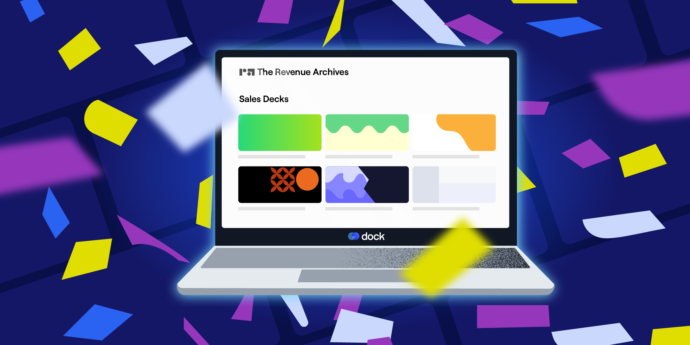
It’s surprisingly difficult to find real sales decks out in the wild—companies hold them pretty tight to the vest. We scoured the internet for months to find all the best B2B sales deck examples, so you don’t have to.

Want to see our full archive of curated B2B sales assets?
Check out 200+ examples of sales decks, one-pagers, battlecards, and more in The Revenue Archives.
Our favorite B2B sales decks
We've boiled down each one of these B2B sales decks into a three‑part micro‑teardown you can skim in under a minute:
- Overview: A snapshot that details who the deck targets and what story it tells.
- Why it works: The specific slide, structure twist, or proof point that landed it on our list.
- Key takeaway: One actionable idea you can lift straight into your own sales deck.
For some decks, we’ve also suggested minor fixes that’d take an already successful sales asset to an even more impactful one.
1. Google Business Messages sales deck
This 2021 deck makes a case for Google Business Messages as the missing link between brands and shoppers who would rather type than talk. It opens with concrete pain‑point statistics, and from there, poses a “What if you could…?” scenario and walks through how the tool plugs into Search, Maps, and owned channels at every buying‑journey moment.
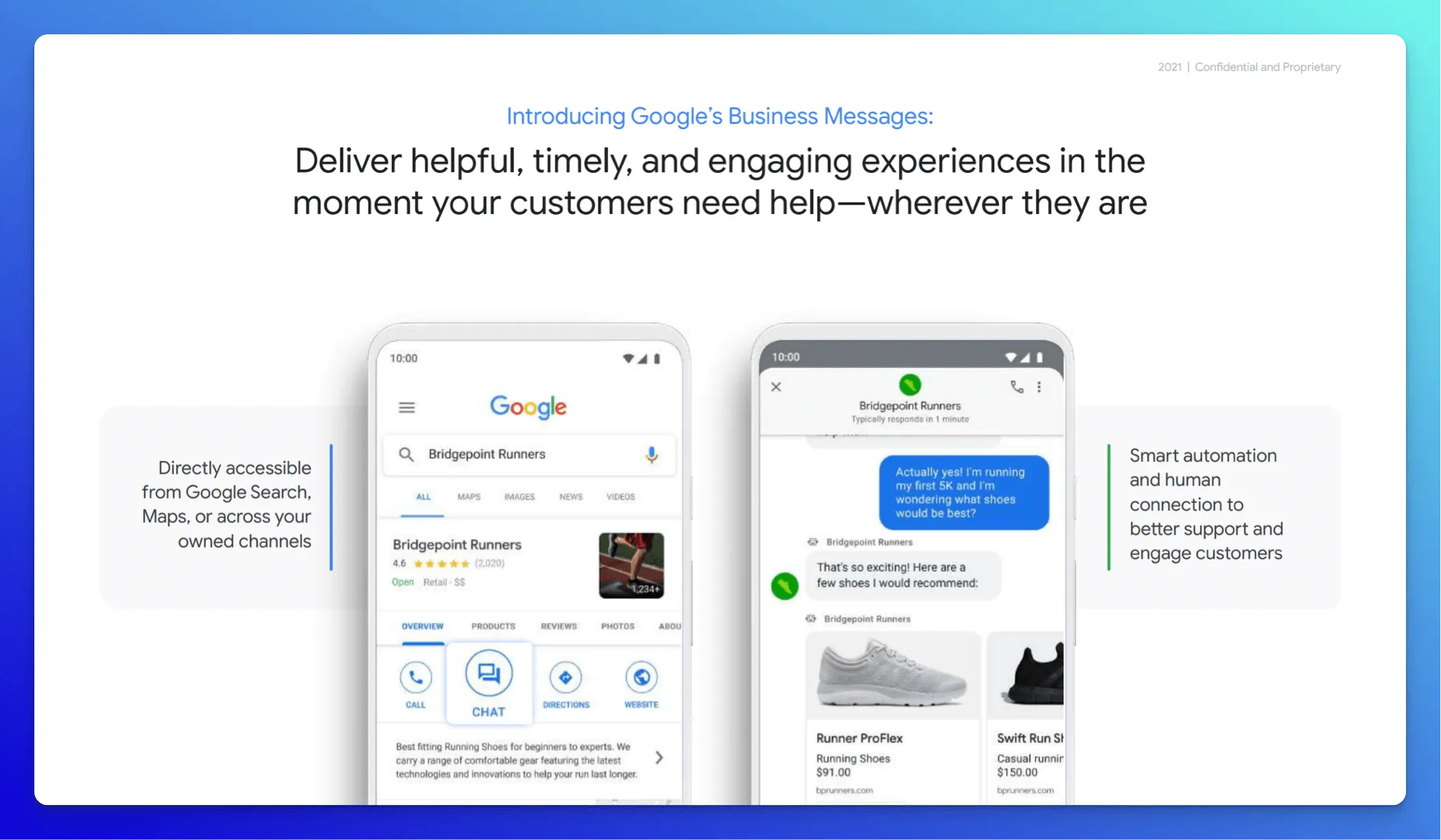
Why it works:
- We like how the slides stay breezy and brand‑true: Google’s white canvas, blue accents, and Material‑style device mock‑ups keep the visuals clean even when screenshots and chat carousels appear.
- Early on in slide 4, two phone frames show Search and in‑thread messaging side by side, visually proving the “meet customers where they are” promise.
- Heavy data never crowds the feature run‑through; instead, success stories for different brands like Levi’s and TEDi sit near the end, letting results punctuate the narrative without derailing it mid‑flow.
💡 Key takeaway: Pair a crisp, number‑driven problem statement with a “what‑if” vision slide, then save detailed customer wins for the finale. That structure keeps prospects focused on how the product slots into their own shopper journey before you flash the social proof.
2. Zuora sales deck
The famed 24‑slide Zuora sales deck speaks to CFOs, CIOs, and product leaders who manage recurring‑revenue products. Almost a decade ago, Andy Rishkin branded it as the “greatest sales deck I’ve ever seen.” On slide 2, the line “We now live in a subscription economy” is plastered over a full‑bleed photo and hashtagged #shifthappens, instantly framing Zuora as the company that named the macro‑trend everyone’s feeling. From there, the flow is textbook narrative: trend → evidence → winners → gap → Zuora’s solution.
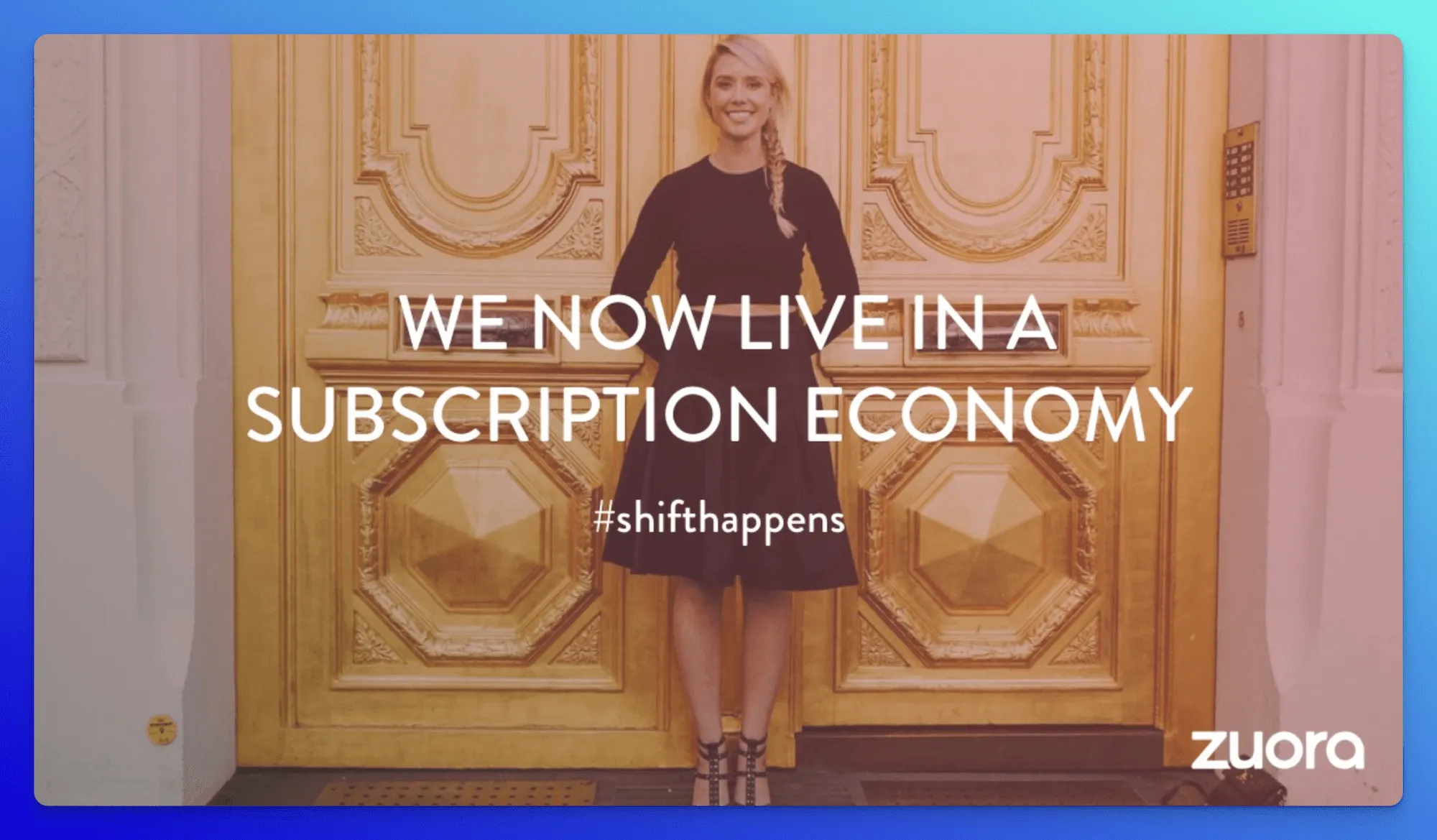
Why it works:
- By naming the shift before explaining the product, Zuora positions itself as the category’s author. Amazon, Google, Apple, Facebook, Uber, Spotify, and Airbnb flash across the slides as survivors of the “product‑to‑service extinction.”
- A rapid‑fire sequence of headlines and data points from The Economist, Credit Suisse, and IDG Research turns the big idea into an indisputable global movement. The message: this isn’t Zuora’s opinion; it’s the market’s verdict.
- A side‑by‑side “Old World vs. New World” graphic reframes a subscriber as a living dataset: purchases, local pricing, usage, refunds, not just “name, email, phone.” That crystallizes the technical gap Zuora fills.
💡 Key takeaway: Coin (or claim) the industry shift first, back it with data and recognizable logos, then introduce yourself as the only logical response. When prospects adopt your vocabulary (e.g., “subscription economy”) directly tied to their pain points, you’re halfway to closed‑won.
3. TeleTracking sales deck
TeleTracking’s deck targets hospital CEOs, COOs, and bed‑management leaders who juggle overcrowded wards and soaring operating costs. It opens with a human‑centered title slide, then walks through the mission, patient‑flow evolution, guiding principles, predictive ROI tables, and ends with provocative copy: “It shouldn’t cost a billion dollars.”
Why it works:
- The entire story lives in six slides, tight enough to fit in one screenshot. Executives can scan the deck in seconds and still grasp mission, problem, and ROI.
- That brevity forces ruthless focus: every inch of real estate goes to data visualizations (wait‑time tables, margin‑impact forecasts) or simple icon timelines, so nothing competes for attention.
- A calming, hospital‑friendly green threads through photos, icons, and tables, creating visual harmony and instantly signaling “healthcare” without a single extra word.
💡 Key takeaway: A micro‑deck that pairs brand‑consistent visuals with CFO‑ready metrics can deliver a full strategic argument at a glance. This is proof that sometimes fewer slides make the strongest case.
4. Woola sales deck
Woola’s sales deck sells one idea fast: ditch plastic, wrap in wool. It opens with a jab—“What’s wrong with blasting bubble wrap?”—then fires back with consumer‑trend statistics and sourcing data that make plastic look out‑of‑step. The deck is a pitch-focused asset designed to convince eco-conscious brands to ditch plastic packaging for sustainable alternatives made from leftover sheep wool.
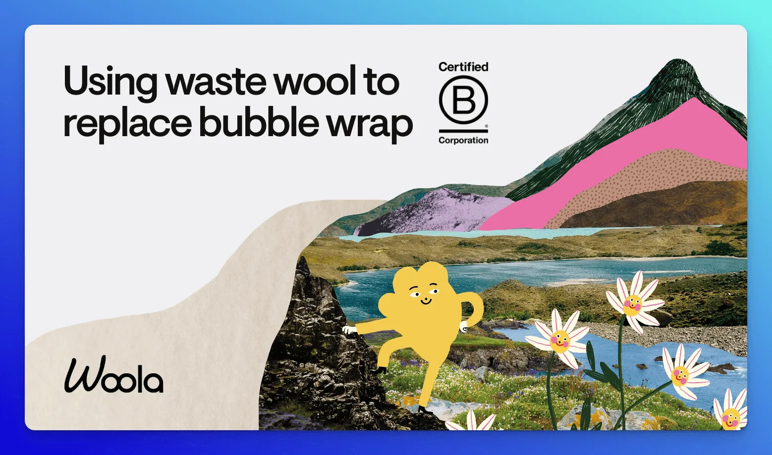
Why it works:
- Woola’s deck hits a visual sweet spot: playful without losing seriousness. The whimsical graphics and conversational CTA (“Care to join us?”) keep the tone accessible but never downplay the urgency of sustainable packaging.
- We love how it frames expectations clearly: a standout slide reads, “Perfect packaging doesn’t exist, but better packaging does.”
- The deck layers in FSC and B‑Corp certificates for procurement, transparent factory and sourcing slides for supply‑chain stakeholders, and Instagram stories from real brands for marketing—covering credibility from every critical angle.
💡 Key takeaway: Woola proves playful visuals don’t dilute serious messaging. Plus, honest positioning (“better, not perfect”) is more compelling (and often more believable) than pretending your product solves every problem at once.
5. Reddit Ads sales deck
Reddit’s sales deck sells the entire Reddit experience. Packed with pop culture references and custom memes, it leans hard into the platform’s irreverent personality. But behind the jokes is a well-structured argument for why Reddit deserves a seat at the table with Google and Meta.
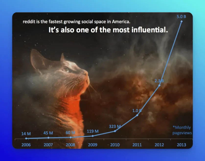
Why it works:
- The first few slides feature Grumpy Cat, lightning-shooting kittens, and pop culture nods like The Beastmaster. Apart from immediately grabbing the audience’s attention, these signal to advertisers: “We understand internet culture because we shape it.”
- After the laughs, the deck drops impressive numbers: 70M monthly readers, 5B pageviews, 20 minutes average time-on-site. A clean pivot from fun to facts, helping advertisers realize Reddit embodies scale, loyalty, and influence.
- From niche subreddits to massive ones like r/malefashionadvice, the deck reminds advertisers that every audience lives here: engaged and self-selecting.
💡 Key takeaway: If your platform thrives on culture and chaos, don’t tone it down, channel it. Just back the vibe with data that makes budget-holders listen.
6. Microsoft Office 365 sales deck
The 49-slide 2015 Microsoft Office 365 sales presentation targets small‑and mid‑sized businesses that struggle with remote collaboration, data security, and day‑to‑day productivity. The deck opens with hard data on mobile‑first work trends to ground the conversation in an urgent, relatable problem.
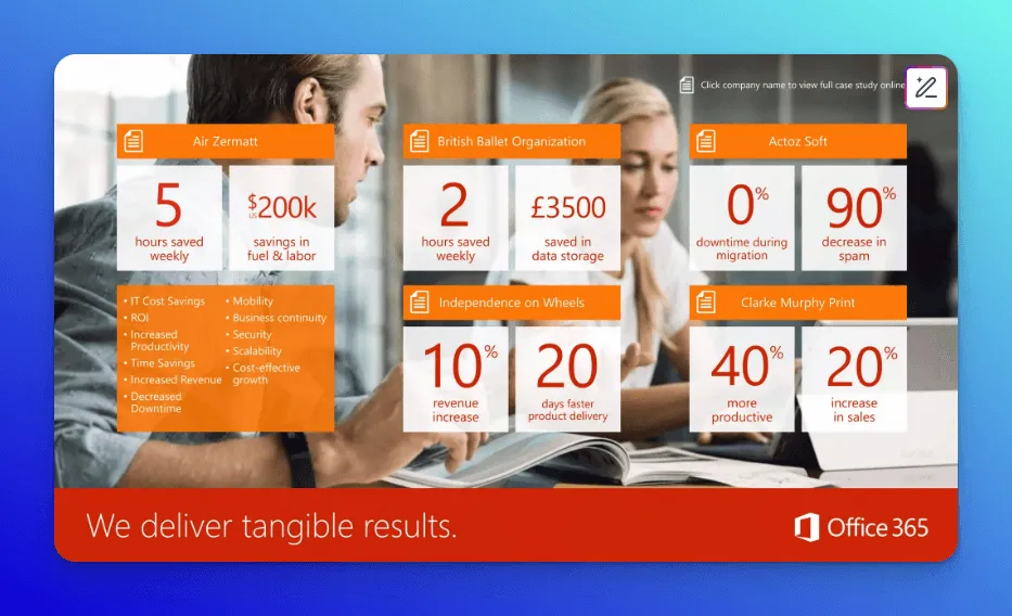
Why it works:
- We see Microsoft’s accent palette running consistently through icons, headers, and call‑outs, so the deck feels unmistakably “on brand” even against full‑bleed photography.
- Slide 10 (our favorite) is the early “tangible‑results” spread: five mini case‑tiles call out 5 hours saved per week, $200k cut in fuel and labor, 0 % migration downtime, a 90 % spam drop, 10 % revenue lift, and 40 % productivity gains—all in giant red numerals that snap the reader’s eye.
- A few slides later, Microsoft drops real product screenshots in situ, followed by a “cross‑platform experience” graphic that shows the same workflow on desktop, tablet, and phone. That one‑two punch lets potential clients picture the software in their own stack without a live sales demo.
The fix we suggest: At 49 slides, the deck is…too much. The narrative structure holds up, but the deck could benefit from a tighter edit to spotlight the strongest claims.
💡 Key takeaway: Front‑load one “money slide” that sums up time saved, revenue gained, or risk reduced, then let deeper product feature slides follow. That single visual is what spreads in Slack threads.
7. 150birds sales deck
The 150birds sales deck pitches a marketing‑automation platform that promises up to 90 % lower acquisition costs while unifying every channel under one roof. In just 20 slides, it moves from a myth‑busting opener to a high‑stakes problem statement, then closes with a single‑click (call-to-action) CTA to schedule a demo.
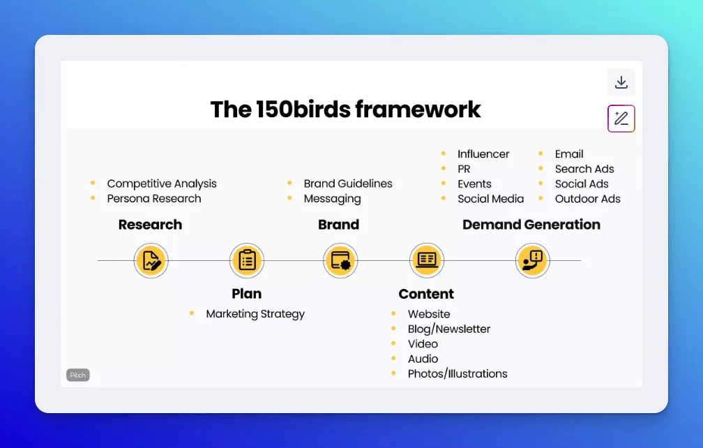
Why it works:
- The opening myth‑bust jolts readers out of “more eyeballs” thinking and sets up conversion funnel optimization as the real lever worth fixing.
- A live marketing‑budget calculator on slide 10 lets prospects plug in their own numbers, translating the cost‑cut claim into personalized savings.
- Four “How it works” slides spell out onboarding with 150 Birds: questionnaire → brand‑asset upload → quick call → plan and forecast, so next steps feel concrete and low‑friction.
💡 Key takeaway: You don’t need a dense, text‑laden deck to win buy‑in. A myth‑busting opener, one interactive proof point, and a crystal‑clear onboarding roadmap can move prospects straight to “schedule a demo.”
8. LinkedIn Sales Navigator sales deck
LinkedIn Sales Navigator’s deck repositions LinkedIn from “networking site” to indispensable prospecting partner. It begins with a demo of a Sales Navigator feature, then drops third‑party proof (Gartner, IDC, Harvard Business Review) that buying journeys are longer and noisier than ever. The visual presentation drops three framing questions: Are you still waiting for buyers to update you? Are you still cold‑calling a list of names? Are you still treating every prospect the same? This pushes readers to admit their current playbook is dated.
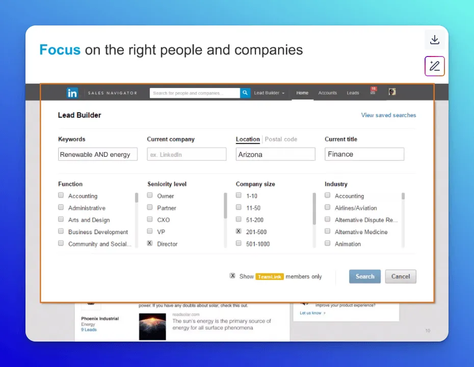
Why it works:
- LinkedIn’s answer to the outdated outreach strategy is a three‑pillar workflow: focus on the right contacts, stay informed on account signals, and build trust through timely outreach. Each pillar is paired with an interface screenshot to show the key product features in action.
- A single “new buying reality” slide distills Gartner, IDC, and HBR data into bite‑size numbers, then immediately asks how the viewer is adapting, turning abstract research into personal urgency.
- A quote on slide 21 from a Social Media Marketing Manager humanizes the promise without breaking the narrative flow, reinforcing that Sales Navigator works for your target audience, not just Fortune 100 logos.
💡 Key takeaway: By citing “2 billion updates each week” and “7 million global companies,” the PowerPoint presentation reframes Sales Navigator as a multiplier on LinkedIn’s existing universe rather than a net‑new expense. Anchor your solution to a rich, first‑party ecosystem customers are already invested in, then show how a modest upgrade turns that dormant data into a day‑to‑day selling advantage.
9. AppsFlyer sales deck
AppsFlyer’s sales deck targets growth marketers juggling a mess of ad networks, agencies, and SDKs. It walks through cross-channel attribution and ROI tracking, backed by logos from brands like Grubhub, PepsiCo, L’Oréal, and Domino’s.
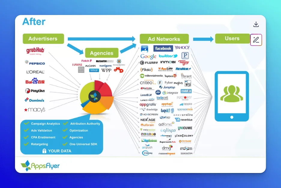
Why it works:
- The deck opens with a side‑by‑side “Before” tangle of ad networks and agencies versus an “After” hub graphic: two infographics that instantly translate mobile‑marketing chaos into a single SDK solution, letting viewers feel the pain and the fix in one glance.
- A billboard of 1,500 integration logos tells prospects, “Your favorite network’s already here,” so they can stop worrying about plumbing and start thinking about scale.
- Household-name clients like Grubhub, PepsiCo, L’Oréal, and Samsung lend enterprise credibility, while a punchy Fiverr testimonial adds relatable peer proof.
- The narrative circles back on slide 21 with a before‑vs‑AppsFlyer table (“spray and pray” against “highly targeted, measured campaigns”) and closes on slide 24 by citing three independent research firms that crown AppsFlyer the market leader, reinforcing the promise with outside authority.
💡 Key takeaway: When your product simplifies a tangled ecosystem, lead with a stark before‑versus‑after visual and back it with proof of scale—trusted brands on one side, vast integrations on the other—to make the business case instantly self‑evident.
10. Canva for Enterprise sales deck
The Canva for Enterprise deck shows enterprise teams how Canva scales design without sacrificing brand control. We open with one knockout statistic: 85% of Fortune 500 companies already use Canva, then walk through locked templates, approval workflows, and team dashboards that keep every slide, tweet, and flyer on‑brand.
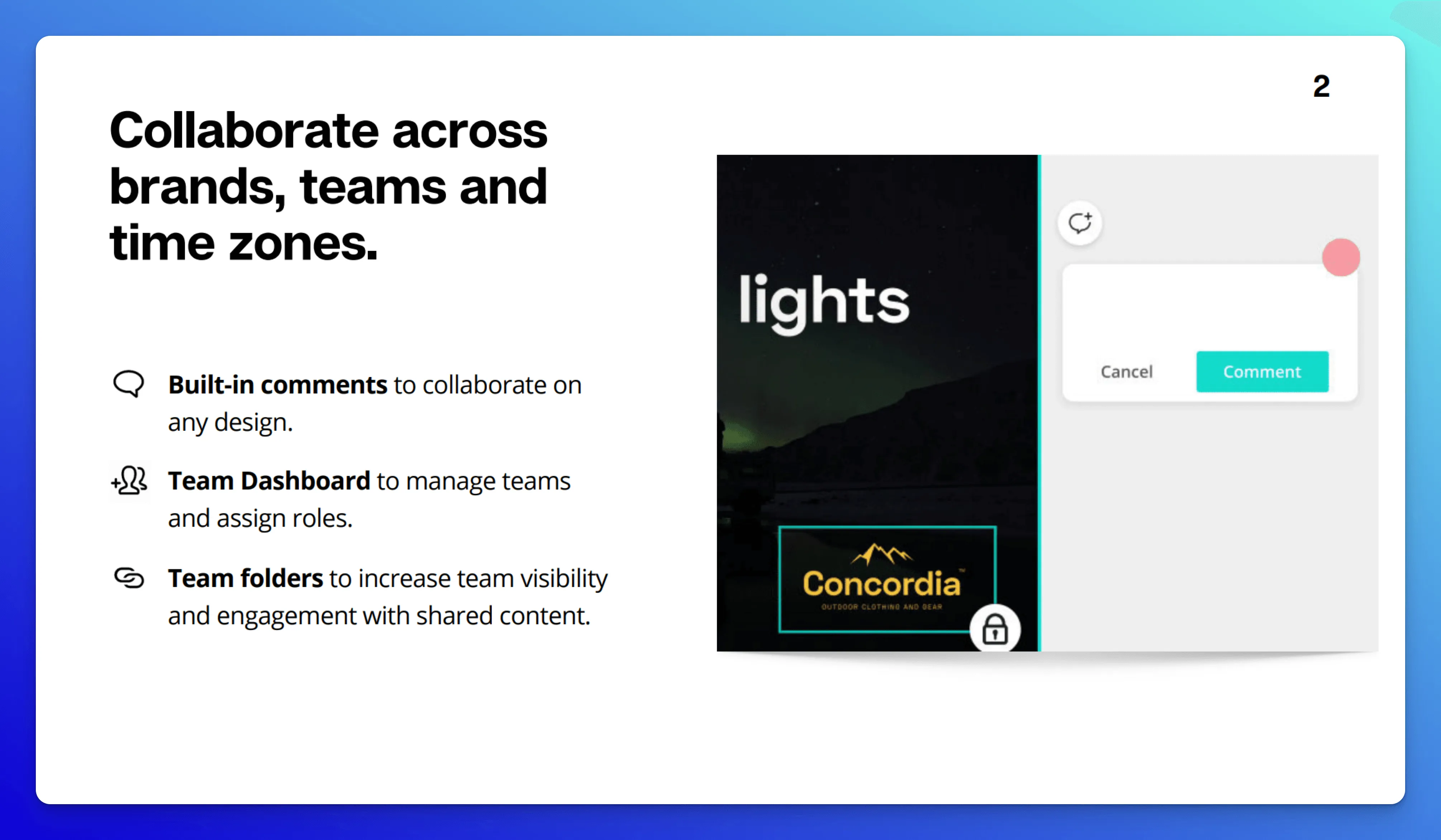
Why it works:
- We really like the quick tour through diverse use cases—Sales decks, Franchise marketing, Real‑Estate listings—plus the RE/MAX shout‑out that shows Canva can flex for teams far outside the usual design bubble.
- You can instantly picture the workflow because every claim (locked brand kits, built‑in comments, team folders) sits next to a crisp user interface screenshot.
- Canva layers credibility from the top down: first, a statistic that 85 % of the Fortune 500 already use it, then Melanie Perkins’ founder quote on democratizing design, a “home‑run” testimonial from a real‑estate client, and finally the Canva for Enterprise GM summing up the platform’s mission. Three voices that link big‑picture vision to real‑world impact.
💡 Key takeaway: The flow shows us a repeatable formula for a sales deck template: lead with your own data, echo it with founder purpose, validate with customer wins, and seal it with hard numbers—so buyers feel both the problem and the proof in one seamless glide.
11. Snapchat Ads sales deck
This bright yellow, emoji‑sprinkled slide deck positions Snapchat as the channel for reaching 13‑ to 34‑year‑olds. It opens with the bold line “Snapchat is the best way to reach 13‑ to 34‑year‑olds,” then stacks first‑party proof: share of smartphone users on Snapchat, daily video‑view counts, and time‑spent stats. From there, it walks advertisers through signature ad formats (full‑screen video, AR lenses, sponsored stories) and drops publisher quotes plus brand case studies to show the platform in action.
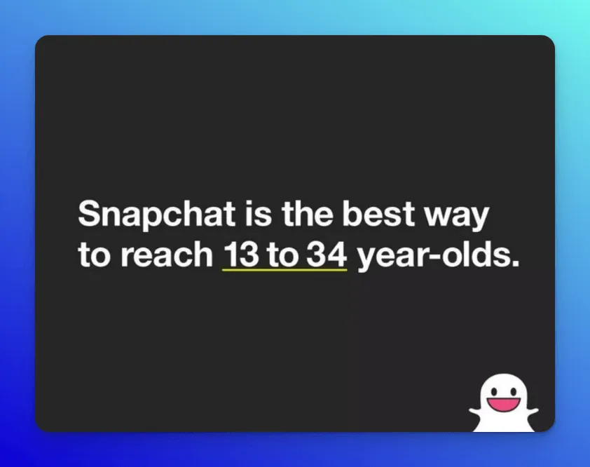
Why it works:
- The claim‑then‑proof opener settles the Gen Z question in under 30 seconds: hard usage stats sit one slide below the headline, so skeptical media buyers can’t miss them.
- A four‑square “guarantee” graphic—always full screen, user‑choice, built for mobile, sound on—distills Snapchat’s differentiators into a single, sticky visual on slide 13.
- We also really like the one‑page FAQ at the end that parks inevitable objections (targeting precision, audience demographics) in plain English, keeping the main flow upbeat while still arming buyers for internal follow‑ups.
💡 Key takeaway: Snapchat proves two big points: you don’t have to abandon a playful brand personality to deliver hard business data, and you can keep a deck tight by parking inevitable objections in a concise FAQ slide. Hold the tone that makes you memorable, but anticipate pushback and answer it head‑on.
12. ClickUp for Product Managers sales deck
ClickUp’s “Ship Faster” deck walks product managers through the exact milestones they chase every sprint: strategy alignment, feedback capture, roadmap planning, sprint execution, and OKR tracking. Each milestone gets a bite‑size chapter: a quick pain snapshot followed by a live ClickUp screen (Docs, Whiteboards, Sprints, Dashboards) that shows the fix in action.
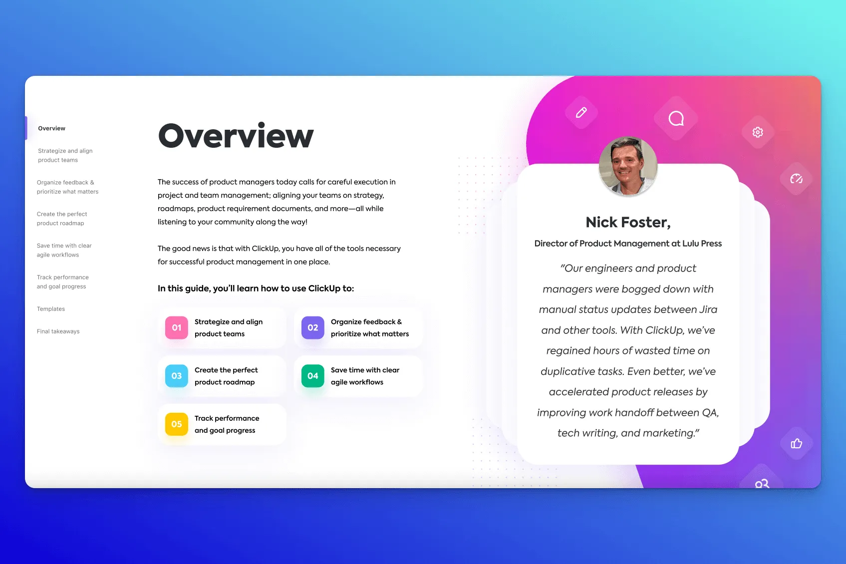
Why it works:
- The deck sprinkles authority where it matters: a Director of Product quote in the “Overview” section, brand logos during the integrations slide, and “800,000+ teams” on the closer, so social proof builds in steady beats instead of one big brag slide.
- A single accent color (ClickUp magenta) frames every screenshot, header, and icon, keeping the long feature parade visually coherent.
- Before the CTA, a one‑page “Final Takeaways” recap lists the five jobs again (“align, collaborate, stay on track…”)—handy for champions who need to screenshot a summary for the Slack thread.
The fix we suggest: The deck leans a little too much on (small) text and tests the buyer’s concentration. If you’ve got to squint to read, you need to font up.
💡 Key takeaway: Treat each slide as a mini “pain → product → outcome” loop. When the audience can trace their daily frustrations straight into a live product screen and see proof that peers have already made the leap, sign‑off meetings get a lot shorter.
13. Folk sales deck
In just 18 slides, Folk’s sales deck walks founders and go‑to‑market leads through the exact flow that makes heavyweight CRMs feel clunky: snag a contact, auto‑enrich it, loop in teammates, fire off personalized outreach, and close together. Each step plays out in a quick product screenshot, so prospects see the fix instead of imagining it.
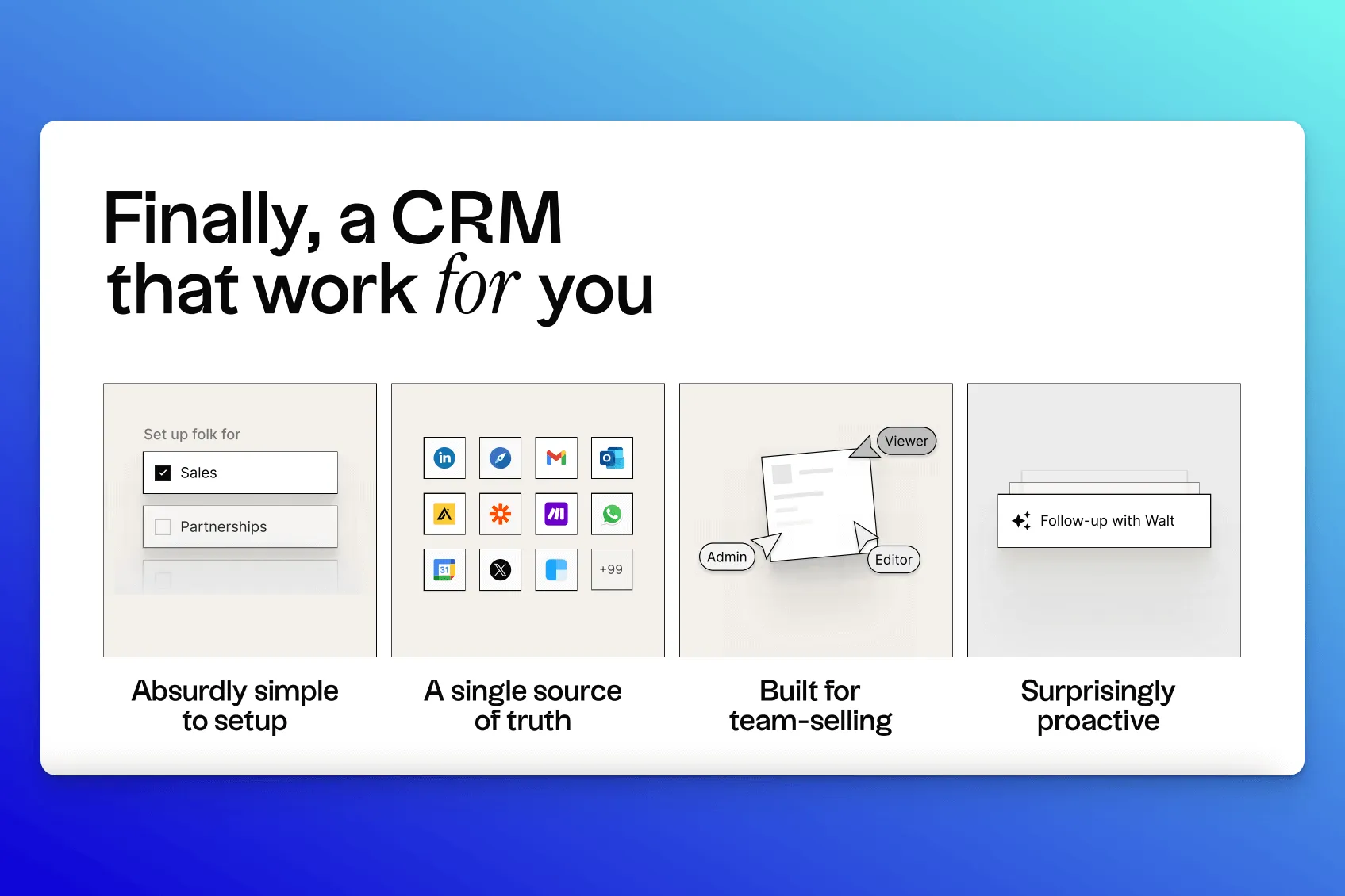
Why it works:
- The narrative mirrors a real buyer journey: from finding leads on LinkedIn to collaborating on deals, so every slide feels like tomorrow’s task list, not a feature dump.
- A one‑page pricing table sits right before the CTA, pairing clear seat‑based plans with “migration, best‑practice consult, tool integration” add‑ons, answering budget and onboarding worries in a single glance.
- We like how credibility hits in two beats: first‑party traction statistics (3k teams, top‑rated on Product Hunt) are followed by a wall of tier‑1 investor and operator logos, proving both usage and backing without pausing for a dense case study.
💡 Key takeaway: Match your slide order to the way your audience actually works: walk through their daily workflow step‑by‑step, show the product solving each pain in real time, and wrap with quick‑scan proof (ratings, investors, pricing) so champions can forward the deck and get instant buy‑in.
14. PlaytestCloud sales deck
PlaytestCloud’s dark‑mode, geometric sales deck speaks straight to UX researchers, producers, and designers who need real‑player feedback before launch. In quick succession, it shows how the platform recruits target gamers, captures commentary‑rich play sessions, and turns recordings into AI‑tagged highlight reels.
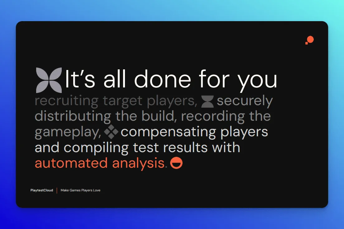
Why it works:
- The deck chops the job‑to‑be‑done into three crystal‑clear steps: target the right players → collect playtest results → turn insights into action, then caps it with the line “It’s all done for you,” sparing studios the mental overhead of imagining how the workflow fits together.
- A developer‑centric look in terms of graphic design is paired with practical reassurances: a “Works on every platform” call‑out for multi‑device teams and a dedicated Security & Compliance slide on slide 12 that details NDA workflows, GDPR safeguards, and encrypted build storage.
- The final CTA, “Make games players love,” ties back to the opening promise and leaves viewers with a player‑first mantra rather than a feature list.
The fix we suggest: We’d yank the “500 million people play games tested on our platform” statistic up to the first section, framing PlaytestCloud’s scale before any feature talk starts.
💡 Key takeaway: This deck nails “no‑brain‑strain” storytelling: friction‑free copy (“It’s all done for you”), developer‑friendly dark‑mode visuals, and grounded numbers (1.5 M ready testers, 500 M monthly players) work in tandem to shrink cognitive clutter for the reader.
15. Sastrify sales deck
The Sastrify sales deck clearly positions its SaaS procurement platform as a straightforward fix for common headaches: overspending on subscriptions and wasting executive time on software negotiations.
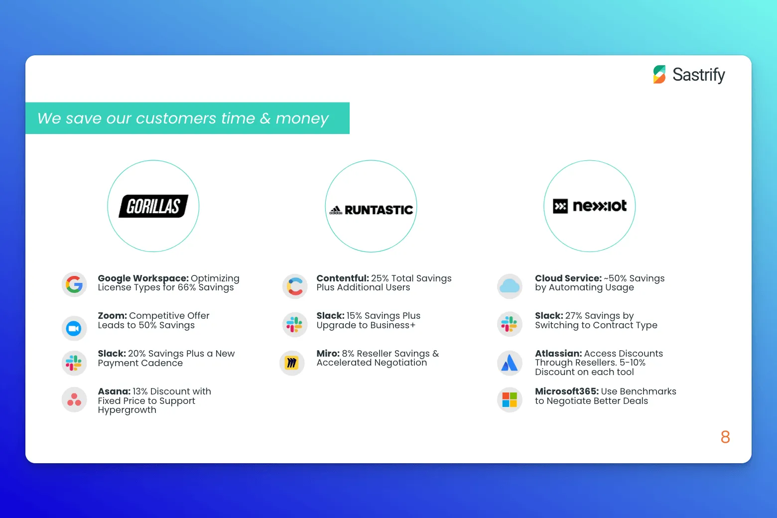
Why it works:
- We especially like that they prove time and cost savings. The slide above lists specific brands alongside exact savings percentages, providing hard evidence that buyers can forward internally.
- The testimonials are thoughtful and diverse, spanning roles from a financial analyst at eBot to an engineering manager at Westwing, which means stakeholders from multiple departments see relatable social proof.
- A clear, fair pricing slide directly addresses budget expectations (“if you’re spending over €5M/month on SaaS, choose Sastrify Enterprise”), followed by a concise FAQ slide that proactively answers common questions.
The fix we suggest: Right now, the closing slide lists more client logos but leaves the reader without a clear next step; adding something like “Book a Demo” or “Get Started” would guide prospects forward. We’d also clarify the source of the claim "Each SaaS negotiation takes more than 5hrs of executives’ time"—without knowing if this is first-party data or third-party research, the deck misses a chance at stronger credibility.
💡 Key takeaway: Sastrify’s deck is a great sales deck example of using precise customer-backed metrics, clear pricing transparency, and role-specific testimonials to directly equip internal champions with the hard proof they need.
16. Patch sales deck
The Patch sales pitch deck positions the company as a clear and credible partner for climate-focused organizations looking to simplify carbon removal solutions.
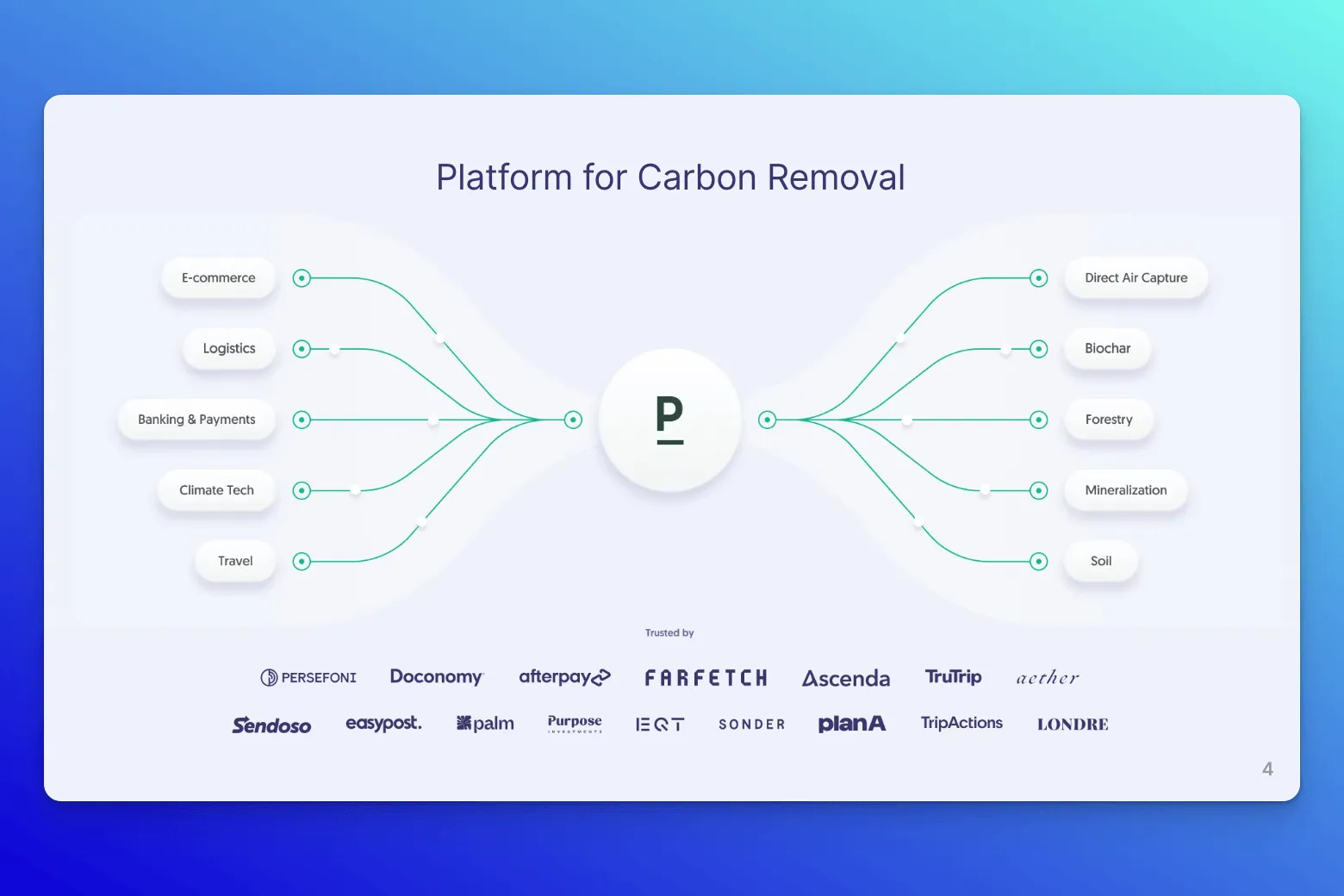
Why it works:
- Patch tackles urgency right away by pairing thoughtful photography with a bold, verifiable statistic on slide 2—instantly framing carbon removal as a business priority.
- The deck is highly action-oriented, clearly outlining two direct ways to engage with Patch: "Buy direct" or "Build using the API." This simplicity lowers friction and nudges buyers toward thinking about immediate next steps.
- We appreciate the minimalist approach: some slides contain just a handful of words paired with impactful infographics.
The fix we suggest: Instead of a generic "Thank you" slide at the end, Patch could leverage the action-oriented language ("buy," "build," "launch") used throughout the deck by including a clear, actionable CTA, like linking directly to developer docs, API documentation, or a help center.
💡 Key takeaway: Patch’s deck nails credibility by never overselling: each "What's possible with Patch" slide pairs a concise feature description ("carbon-neutral shipping," "climate-positive NFTs") with a clean product interface screenshot, making it easy to picture how these solutions fit into everyday workflows.
17. Linear sales deck
Linear’s deck is built for software teams fed up with bloated, sluggish tools that make simple tasks feel like a slog. Instead of rambling through features, it positions Linear as the antidote: fast, clean, and designed with developers in mind.
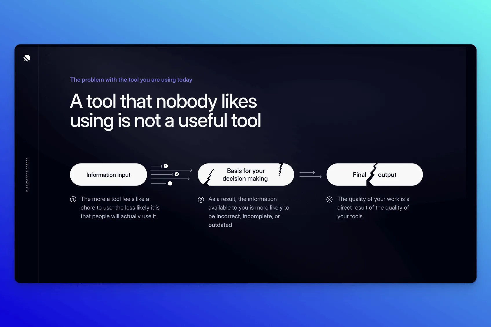
Why it works:
- We appreciate the irreverent, conversational copy ("A tool nobody likes using isn't a useful tool"), which clearly captures the frustration of the audience, making Linear feel approachable rather than corporate.
- The deck introduces the idea of "developer ergonomics," a concept that frames Linear as a thoughtful, human-centric upgrade that teams actually want to use. Interestingly, the “ergonomics” is also baked into the deck design: clean layouts and a rhythm that mirrors how developer teams actually process information.
- The final CTA cleverly accommodates both self-service buyers ("Create Linear account") and enterprise buyers ("Contact Sales"), removing friction regardless of how prospects prefer to evaluate software.
The fix we suggest: Adding more explicit first-party data or metrics earlier in the deck (such as typical improvements in issue resolution time or productivity boosts) could improve an already-excellent deck.
💡 Key takeaway: This deck makes you feel the problem. By visually and emotionally mapping the buyer’s current frustrations before introducing the product, Linear turns pain into momentum. Build tension first, then offer relief.
18. Spendesk sales deck
Spendesk’s sales deck pitches its seven-in-one spend management platform to finance teams tired of chaos. It walks prospects through who they are, what they solve, and how they help businesses track, control, and optimize spending across the board, from payments to approvals.

Why it works:
- The social proof—company logos—are grouped by industry. This is a smart touch that helps B2B decision makers quickly see relevance based on their vertical.
- Customer support is called out explicitly, which is a strong move for a spend management platform, where onboarding and troubleshooting are often pain points.
- The visual variety keeps things moving: bullet points, graphs, infographics, and icon-led blocks all show up across the deck to illustrate key points. The content stays lightweight, but the meaning comes through clearly.
The fix we suggest: The “See where these numbers come from” link on slide 9 leads to a private Google Sheet. Either embed key figures directly into the deck with proper sourcing, or link to a gated but polished resource hub (e.g., a one-pager or customer story with visual statistics). Also, the “About Us” timeline is a nice touch for context, but it comes too early. If the viewer only has 30 seconds, this slide will get skipped.
💡 Key takeaway: Spendesk shows how to use pacing and layout to your advantage. Several slides act as visual breathers: using a bold header or single-line setup to introduce what’s coming next. That rhythm keeps the deck skimm-able and avoids overwhelming the reader, even across 20 slides.
19. Pocus sales deck
The Pocus sales deck is a sharp, product-led pitch that shows how revenue teams can turn messy usage data into clear sales signals. From workflow breakdowns to no-code benefits, every slide is built to explain, not overwhelm.
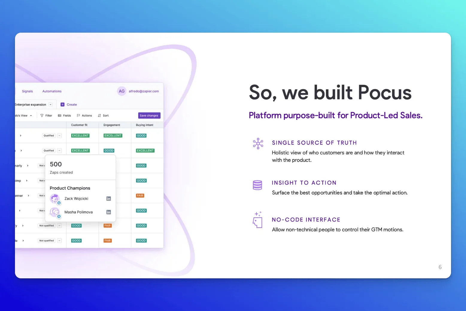
Why it works:
- Right up top, slide two contrasts old-school sales with product-led sales using a clean, side-by-side infographic. From there, it quickly defines product-led sales and makes a bold claim: this is the future of SaaS.
- Instead of just pitching features, the deck frames Pocus as a no-code, single source of truth that helps teams move from “insight to action.” The workflow slide is especially smart—it breaks the process into four clean steps (Connect, Configure, Prioritize, Action) and keeps the layout light so the value lands fast.
- Throughout, the copy speaks directly to non-technical stakeholders who still want control over GTM and bottom-line benefits.
The fix we suggest: The deck includes several customer testimonials, but none are attributed to specific names, titles, or companies. Adding real names and roles would ground the social proof. The “Real cost of build vs. buy” slide gestures at the tradeoff but lacks an actual cost breakdown. Including even a rough comparison (e.g., engineering hours vs. subscription pricing) would make the benefits far more tangible.
💡 Key takeaway: When you're introducing a relatively new concept, like product-led sales, it helps to anchor the pitch with a clear, step-by-step “How it works” slide. Pocus does this well, offering buyers a quick, visual walkthrough of what to expect, which lowers friction and builds confidence in unfamiliar territory.
20. Asana sales deck
The Asana sales deck walks prospects through how the platform actually helps teams stay organized, cut down on busywork, and move faster. The deck shows the platform’s features in action, with mockups across devices, real product screenshots, and clear before-and-after moments.
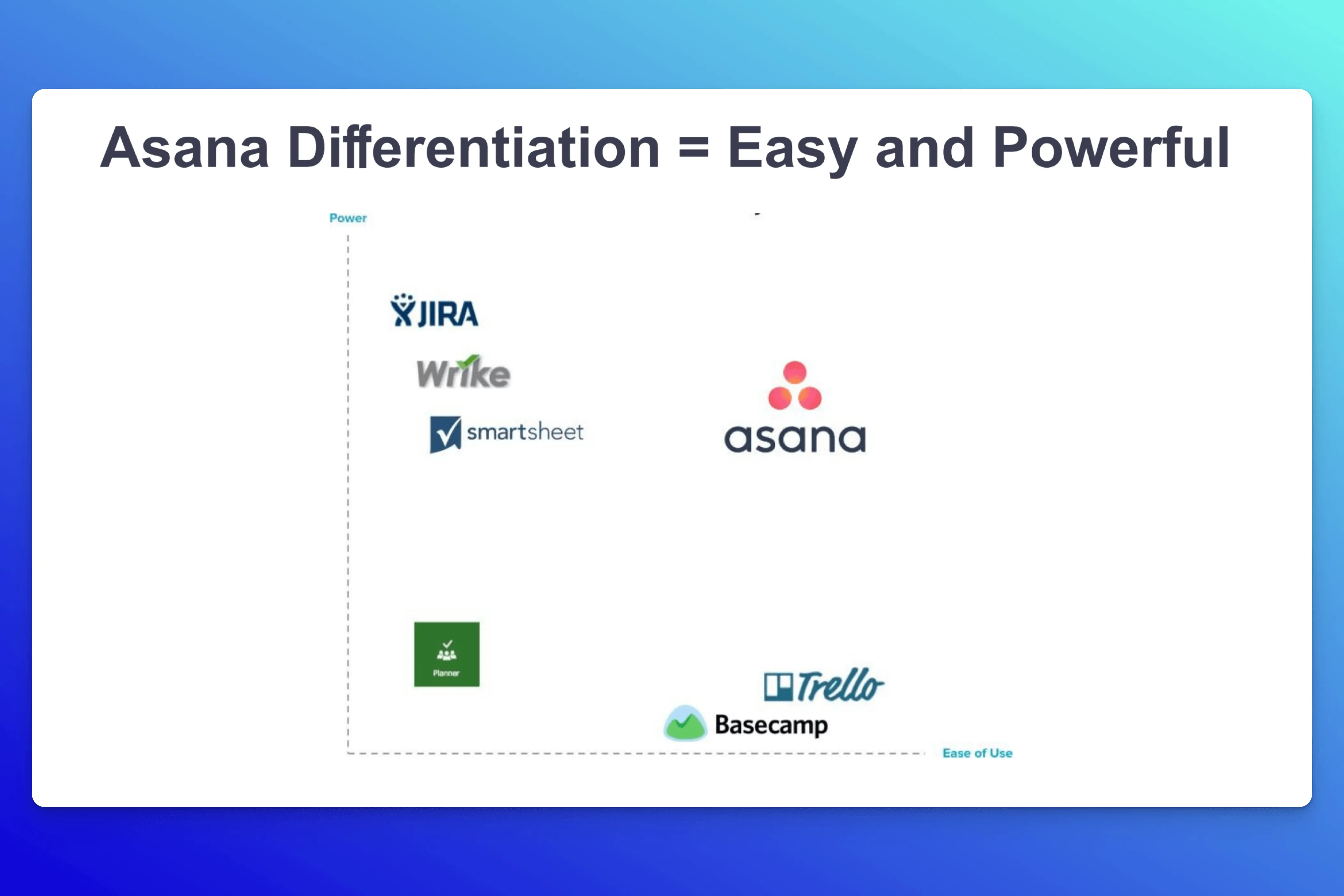
Why it works:
- The differentiation slide is sharp: a simple graph compares “power” and “ease of use” across competing tools. Trello and Basecamp show up as easy but limited. Wrike’s powerful but clunky. Asana sits confidently in the middle: powerful and usable.
- The deck also leans into credibility. A full logo wall showcases well-known brands across industries: Slack, Bose, Spotify, Vice, and even NASA.
- The presentation shows how Asana reduces “work about work,” with statistics and cited sources to back it up. One standout slide maps Asana’s compatibility with other tools, helping teams quickly understand whether it’ll slot into their existing tech stack or create more fragmentation tax.
The fix we suggest: Some of the main slides feel repetitive. Certain messages are reinforced multiple times, which could either land as helpful emphasis or as unnecessary filler, depending on the buyer’s patience.
💡 Key takeaway: Use multiple forms of social proof to drive your point home. Asana rattles off logos but also backs up their promise with first-party data from their own users. A statistic like “Asana has made teams 45% more efficient” lands harder because it’s measurable, specific, and tied directly to product value.
21. Verizon sales deck
The Verizon sales deck puts its Managed Security Services front and center, framing them as a full-force defense system for modern enterprises. The pitch presentation walks through how Verizon helps businesses stay ahead of threats by leaning on their global network, seasoned analysts, and real-time security intelligence.
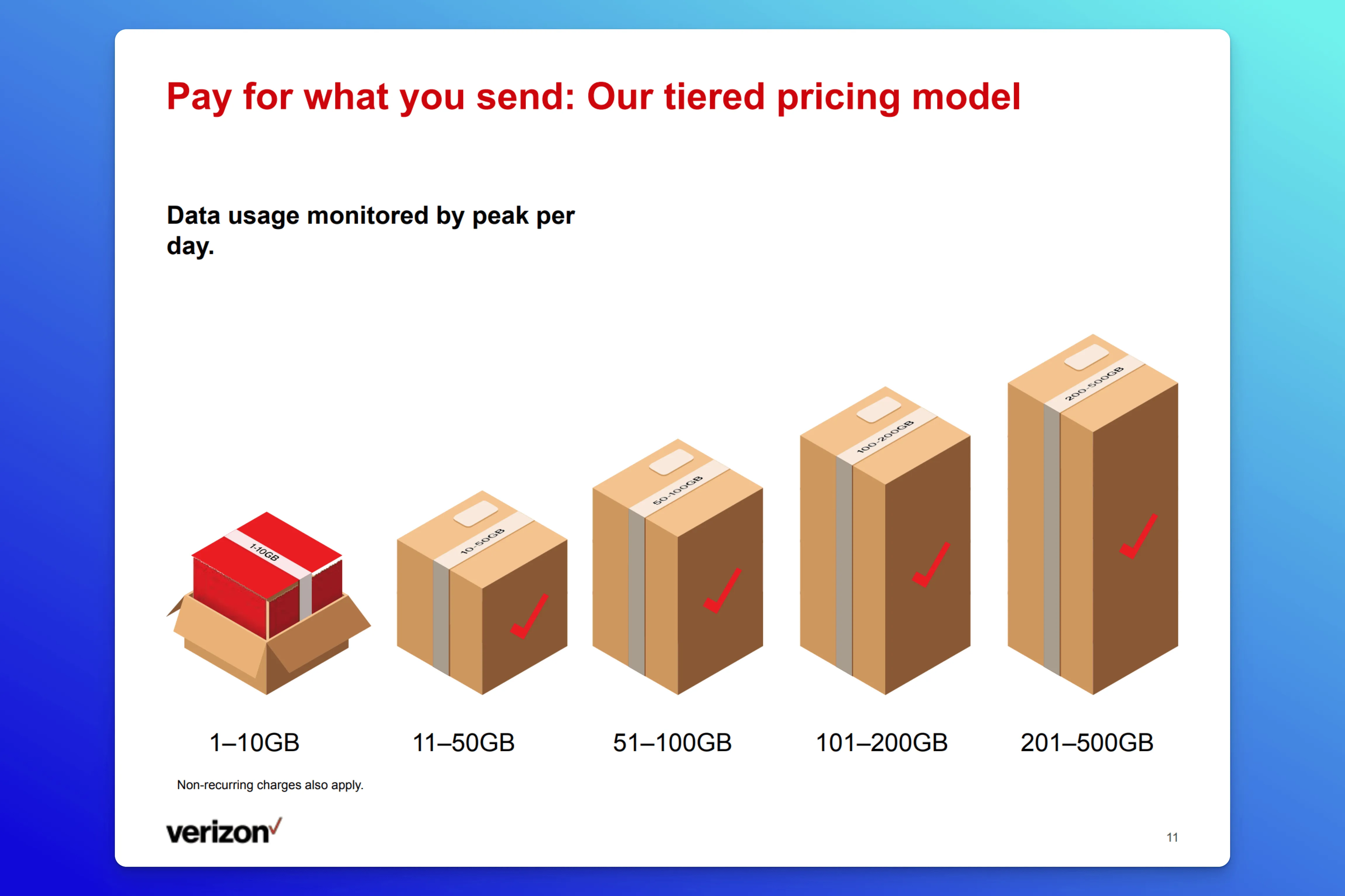
Why it works:
- The deck opens strong with a clear, high-stakes hook: cybersecurity is more complicated and important than ever. That urgency carries through into the positioning. Instead of pitching security as a line item, Verizon frames analytics as a core business enabler, something strategic, not reactive.
- The sales narrative does a solid job of walking the viewer through both process and people. One slide maps out exactly how threat detection and response flow across the system, and who’s behind the wheel.
- For teams that want to dig deeper, the appendix pulls its weight. It stretches across seven slides covering security portfolios, industry use cases, and public-sector readiness, without feeling like an afterthought.
The fix we suggest: The pricing model shows up early on slide 10, before Verizon’s full value is laid out. While it’s a solid “pay as you grow” approach, it lands before the viewer is fully sold. Move it to the end as part of the CTA, where it can seal the deal instead of jumping the gun.
💡 Key takeaway: If your offer is complex, use structure to your advantage. Verizon’s deck breaks down a dense cybersecurity solution into digestible chunks: process, team, features, pricing, and proof, so buyers aren’t overwhelmed.
22. Leadnomics sales deck
The Leadnomics sales deck presents a confident, well-structured case for how the company helps brands scale customer acquisition. The sales pitch blends clean design with hard numbers, spotlighting successful campaigns and performance metrics to show the real impact of their lead generation strategy.
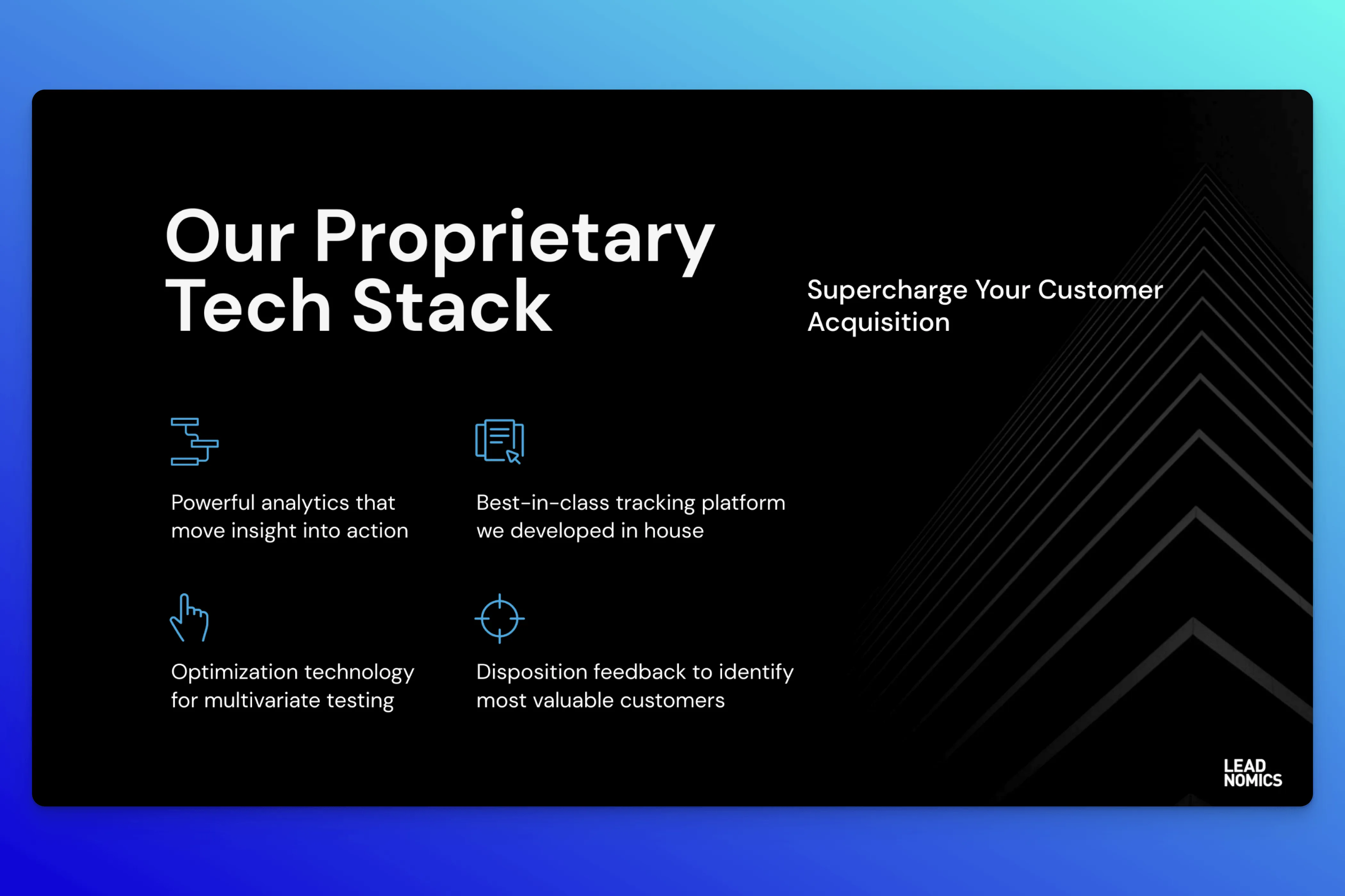
Why it works:
- The first thing you’ll notice is how readable it is. The typography is front and center without shouting: clear, confident, and easy on the eyes. By slide 2, they've already dropped recognizable logos to establish credibility, and later on, they double down with a full EverQuote case study instead of tossing in generic testimonials.
- That case study hits all the right notes: it outlines the pain points, shows measurable results (like a 20% drop in CPA in just 30 days), includes a quote from the SVP at EverQuote, and finishes with a statistic that positions Leadnomics as their largest third-party traffic provider.
- The deck design itself flows well: clean product mockups, a dark-light slide rhythm that keeps it visually engaging without being distracting. They emphasize their partnership model (“here’s how we work” and “here’s how we do it” slides), and even the CTA brings energy: “Let’s do this,” followed by direct contact information for the VP of Sales.
The fix we suggest: While the “Here’s How We Do It” section is a solid inclusion, it’s visually dense. The copy hits all the right talking points, but there’s no clear anchor for the eye. A few well-placed icons, stronger visual hierarchy, or even slight font variation could go a long way.
💡 Key takeaway: Sometimes, one well-chosen case study is more powerful than a dozen scattered logos.
23. Chatlayer sales deck
The Chatlayer sales deck walks through how their conversational AI helps businesses automate customer interactions across channels. Think WhatsApp, web, and beyond. It leans on real examples and performance metrics to show how automation can boost engagement while keeping support costs in check.
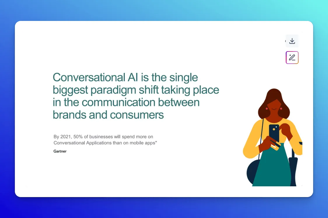
Why it works:
- “Authentic conversations start here” is a nice first slide—and contrast—to the usual bot-speak in a presentation about AI. Right away, they ground their pitch in behavior shifts: 5 billion messaging app users, rising expectations for instant, actionable support, and a (then) up-to-date Gartner statistic on conversational applications.
- A mid-deck “Benefits in a nutshell” slide uses a phone mock-up to demonstrate the chatbot flow in action, which adds context without extra copy.
- The call to action, “What will we talk about next?” ties everything back to the product’s promise: a better kind of conversation. Then come the case studies where each industry gets its own slide: food delivery (iFood), banking (Belfius), travel (URail), and telecom (Proximus).
The fix we suggest: The slide that says “What will we talk about next?” feels like a perfect closing moment: it’s playful, open-ended, and aligns with the product’s core value of conversational engagement. But instead of ending there, the deck rolls into case studies. We’d flip the order: bring the case studies earlier to build credibility and end strong with that CTA.
💡 Key takeaway: If your product is built around conversation, end on a note that invites one.
24. ChartMogul sales deck
The ChartMogul sales deck walks prospects through how their subscription analytics platform actually drives impact: faster insights, smarter growth decisions, and clearer revenue reporting. It’s structured around real-world use cases, ROI metrics, and standout features that speak directly to SaaS operators and finance leaders.
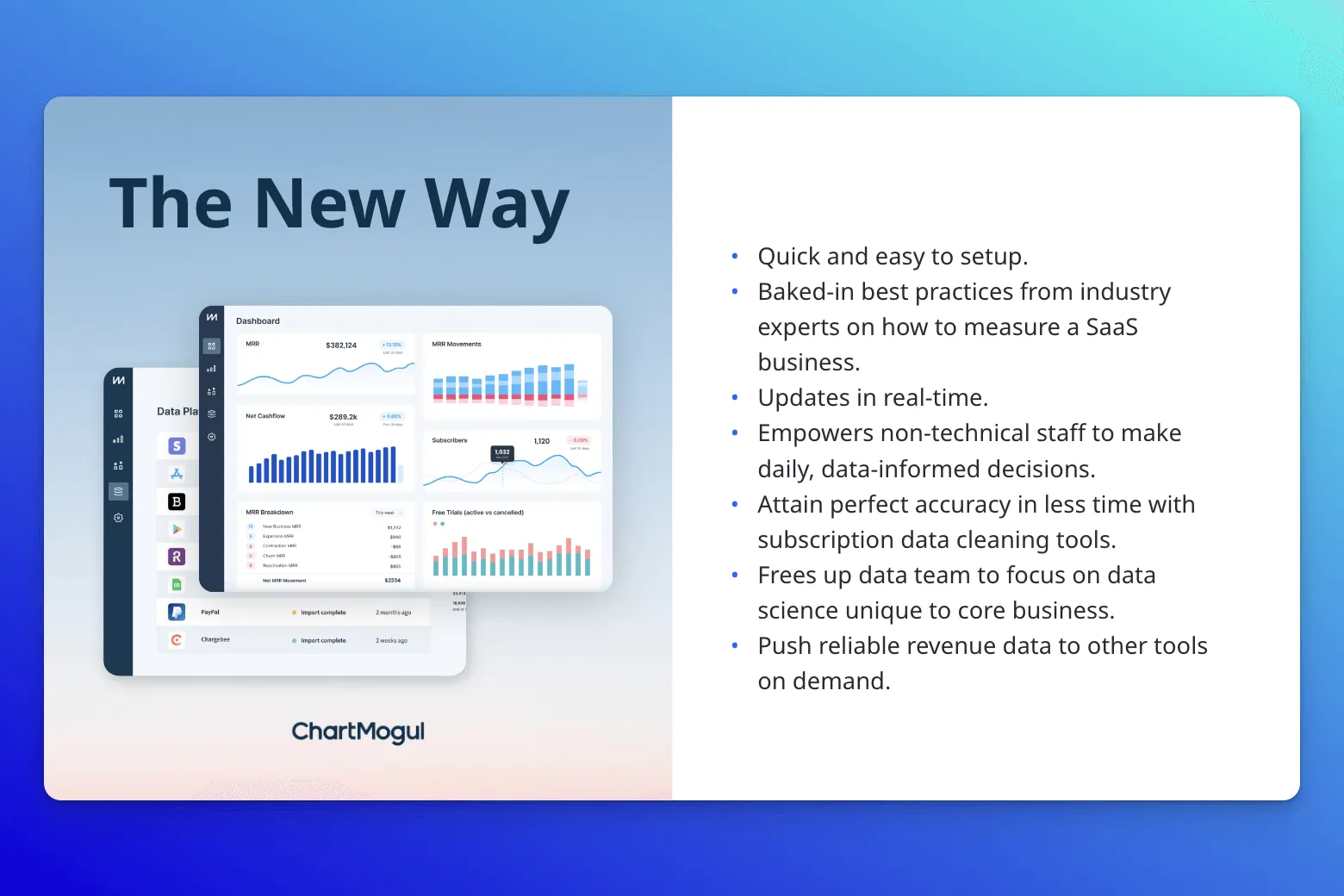
Why it works:
- ChartMogul’s deck succeeds because it’s structured to match the cognitive journey of a skeptical buyer. By opening with a concise articulation of a shared industry pain point, and instead of rushing to pitch features, it spends time contrasting legacy approaches with their own, setting the stage for clear differentiation.
- While the visuals and copy explain how the platform is set up and how it works, the tone is anchored in growth outcomes: faster decisions, better forecasting, and a shared source of truth across the organization.
- The full-slide quote from a CEO quantifies the product’s return by anchoring its value in real business results and gives prospects something tangible to trust.
The fix we suggest: The subscriber lifecycle slide is buried too late in the deck. Moving it earlier, for example, before the solution or “how it works” section, would help set the stage for the complexity ChartMogul solves. Some of the copy, while effective, could be tightened. The problem statement starts strong (“Accurately calculating SaaS metrics is hard”) but immediately shifts into a wordy follow-up: “Harnessing subscription data to inform decisions that lead to faster growth is even harder.” Breaking this into two sharper, more digestible lines would make the message land faster.
💡 Key takeaway: When you're selling a data-heavy product, clarity matters more than cleverness. ChartMogul’s deck works because it visualizes complex concepts, like subscriber lifecycle and platform architecture, in a way that’s instantly understandable, even for non-technical buyers.
In a Grow and Tell episode, Joseph Schmitt, VP of Customer Success at UpKeep and former Sr. Manager of CS at PatientPop, breaks down how to sell to buyers who’ve never worked with highly technical products:
See how other teams are enabling their champions. Our Revenue Archives is your source for real examples of sales decks, one-pagers, pricing tools, and more.
See how other teams are enabling their champions.
The Revenue Archives is your source for real examples of sales decks, one-pagers, pricing tools, and more.
What makes a great sales deck?
First, let’s be clear: a sales deck shouldn't be the centerpiece of your pitch.
The conversation is the pitch. The deck is visual support, a discovery guide, and a leave-behind to enable your champion.
That said, winning sales decks do a few things really well.
1. They show they get their buyers
A great sales deck immediately proves it understands the buyer’s world, whether that’s the KPIs they’re chasing, the blockers they’re stuck behind, or the internal politics they’re up against.
Build targeted decks for different customer segments: enterprise vs. mid-market, technical vs. operational buyers, retail vs. SaaS.
The more tailored the deck, the more likely it is to land.
2. They tell a clear before/after story
There’s always a gap between the current state and the desired one. Effective decks draw that line clearly:
- What’s broken?
- What happens if it stays that way?
- What’s possible with the right fix?
3. They empower your buyer champion
Most sales don’t close in the first call. Your champion has to resell your story internally, often to executives who haven’t met you.
A successful sales deck helps them do that by being structured, skim-able, and memorable.
Think: bold problem framing, a three-step solution, and one killer proof point that’s hard to forget.
4. They minimize what we call the “imagination tax”
Saying “streamlined UX” isn’t enough. Show the interface. Don’t say “seamless integrations.” Map them out. Buyers shouldn’t have to mentally fill in the blanks. When you remove that cognitive friction, it’s easier for them to buy in.
5. They (largely) follow the 10–20–30 rule
This classic rule comes from venture capitalist and former Apple evangelist Guy Kawasaki, who introduced it after suffering through one too many bloated startup pitches.
His tongue-in-cheek explanation is that too many bad decks gave him Ménière’s disease—causing hearing loss, ringing in the ears, and vertigo.

Here’s his 10–20–30 Rule of PowerPoint:
- 10 slides: That’s the limit. Most people can’t process more than ten key ideas in one sitting. If you need more slides, your narrative probably isn’t clear enough.
- 20 minutes: Even with a one-hour meeting, aim to finish your deck in twenty. You’ll need the rest of the time for late arrivals, technical issues, and real conversation.
- 30-point font: Shrink your font, lose your audience. Larger fonts force you to simplify, clarify, and avoid the trap of reading off your slides.
Kawasaki originally framed this for founders pitching to investors, but it applies just as well to sales, partnerships, and stakeholder buy-in. The point isn’t to be dogmatic—it’s to be digestible. You can always include more details in appendix slides or a follow-up email. But during the pitch, less is more.
The best way(s) to share sales decks with customers
According to LXA’s State of Sales Enablement Report 2025, 78% of buyers want to self-educate across channels, on their own time.
Your deck might shine live, but the real decision happens after the call—when your champion has to tell the story without you. If all they’ve got is a PDF, you’re adding friction.
A digital sales room removes this barrier because it feels like it's built for buyers: interactive, personalized, and easy to share internally when making the internal sales pitch.
Here’s how static sales decks and interactive digital sales rooms like Dock compare at a glance:
Also, you’ve got to budget for design software, slide tools, and maybe even hire someone to make static slide decks look polished. And the end result is a glorified PDF that enterprise buyers have to squint through. That doesn’t exactly scream a “premium buying experience.”
Take it from Brad Ansley, Account Executive at BrightHire.
BrightHire sells AI-powered hiring software, which means every deal involves legal, compliance, IT, and a champion navigating all of it.
Onboarding was difficult to scale and standardize because every customer had a different tech stack, which affected nearly every part of the implementation plan.
With Dock, their Sales team created a single shared workspace to house ROI materials, compliance docs, and follow-ups, so every stakeholder got what they needed, without the back-and-forth.
“Dock gave me a way to standardize all the information we shared with prospects,” says Brad. “It made the follow-up process and deal management so much easier than it was before.”
Real-life impact: 22% increase in deals closed, 20% lift in average deal size, and faster deal cycles and better visibility into stakeholder engagement.
Use Dock, not decks
If you’re looking for more sales asset inspiration, explore our Revenue Archives. From ROI calculators and sales decks to onboarding tools and testimonial videos, it’s a goldmine of what great enablement looks like in the wild.
If you want to enable your champions, reduce back-and-forth, and make the buyer experience feel premium from day one, Dock’s your move.
Here are a few ways to get started:
👉 Use our Digital Sales Room Template to create a single link to rule them all. Drop in case studies, recap sales calls, and help your champion steer the deal forward. This template gives you a centralized, collaborative space to align stakeholders and simplify approvals.
👉 Sign up for Dock for free. Your first 50 client workspaces are free.
Sales deck FAQs
What is a sales deck?
A sales deck, also called a sales presentation or sales pitch deck, is a visual presentation often built in Google Slides, PowerPoint, or Keynote designed to pitch your product or service to potential customers. The presentation lays out your value proposition, proof points, and differentiators in a clear, structured story that helps your champion sell internally.
What's the difference between a sales deck and a pitch deck?
A pitch deck is built to win buy-in, whether from investors or partners.
A sales deck is tailored for potential customers, designed to walk them through the problem, solution, and proof, so your champion has everything they need to push the deal forward.
How long should a sales deck be?
Aim for 8–20 slides, max. Long enough to tell a clear before-and-after story, short enough to hold attention. If you need more detail, move it to the appendix slides or digital sales room in your follow-up. Don’t cram it into the core flow.


Related Revenue Lab Articles


.webp)


Templates for Sales, Onboarding,
Projects and Portals
Customize and share with clients


